|
This is my first Periscope broadcast where I share a sneak peek of my current watercolor painting and discuss dry brush technique. (The Periscope broadcast on Periscopetv cuts out some of the footage, but this video was what was saved to my phone and its intact.)
1 Comment
 Welcome to my first Doodle Dynamics post at Refresh Daily!
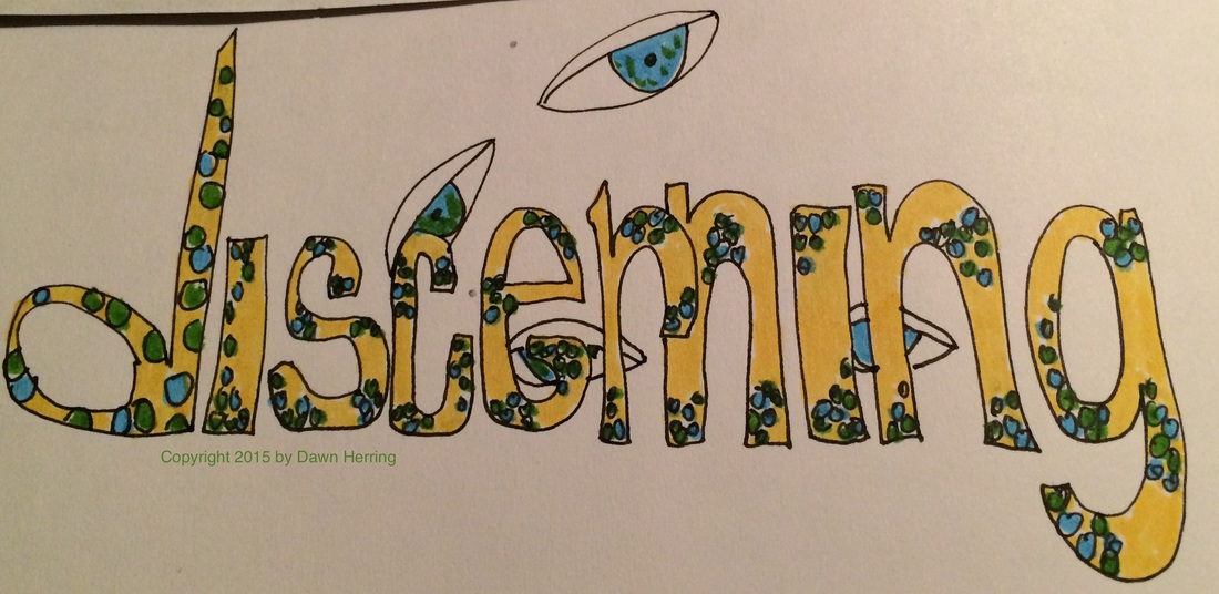
I am a huge doodle fan; I've been creating nightly doodles from the summary word I reference to extract the deepest understanding of my daily experiences. I have been having so much FUN creating word doodles, which I started back in January of 2014 (in conjunction with a fun creative course by Jani Franck) and added COLOR with Winsor Newton Watercolor markers to make my doodles sing back in November of 2014. So it's been almost a year that I've been in the colorful side of my doodles. And I just can't get enough of it! :) I've decided to share an occasion doodle with you directly from my personal journal, especially ones where the design and color scheme really please my eye. I had such fun with this one, discerning. That day I felt my "discerning" vision was very telling and insightful, whether through direct observation or inner consideration, thus the "eyes" in the background, one being more visible, the other more hidden. I used pretty straightforward lettering, but had some delight with embellishing using small circles like little jewels. I filled the letters with Yellow Ochre and then used Sap Green and Cerulean Blue Hue for the jewel areas. I love the contrast between the letter shade and the "Jewel" colors. Journaling Prompt: Recall a day when you had "extra vision" initiating discernment that helped you understand yourself and your world better. Detail what you learned from that discernment and any decisions you made as a result. Did you find that discernment "eye opening?" Art Journal Prompt: Use images of eyes and/or use the word Discernment as a word prompt for your visual spread, choosing colors that initiate clearer "vision" for you. 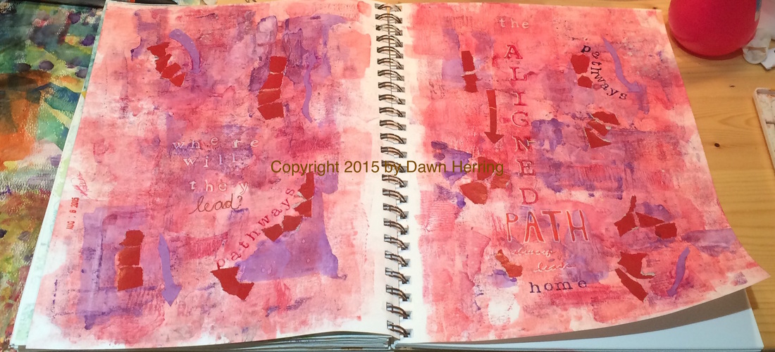 Pathways Full Art Journal Spread Copyright by Dawn Herring This art journal spread, Pathways, took me on a colorful pathway with reds and purples. Since my previous spread worked out so well with using a brayer to apply watercolor paint to the page, I decided to continue this trend yet again, applying layers of red washes. When I applied the purple hues, I used a palette knife for more focused areas and controlled application. Once I had that done, I accentuated the areas of paint with torn bits of magazine paper in red I had stashed and applied them with matte medium. This created areas or sections on each side, and they reminded me of pathways that lead to different places. Thus, Pathways, became my focus. That's when I determined to stamp out the word pathways along two of those sections, one on each side, using red and purple paint. 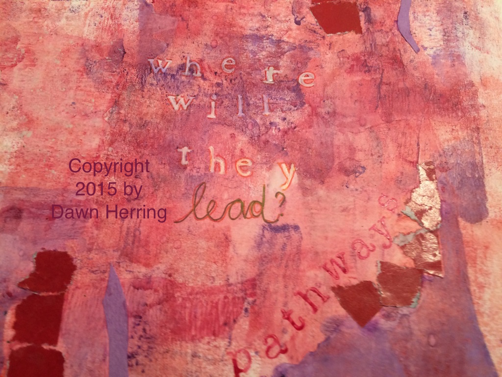 As I considered the issue of Pathways and what ones are in my life right now, (this is what happens as I'm creating an art journal spread: it opens pathways of thought and brings subconscious ideas to the fore and that's when I learn something about myself; always worth the time invested). As I considered my next step in this spread, I began to think about what this message could be teaching me right now. In this process, I determined to stamp out the question: Where will they lead? I used my Uniball white pen on stamped letters and the wrote the word, Lead, with Uniball pens in different colors. I also outlined the white letters with red pen. 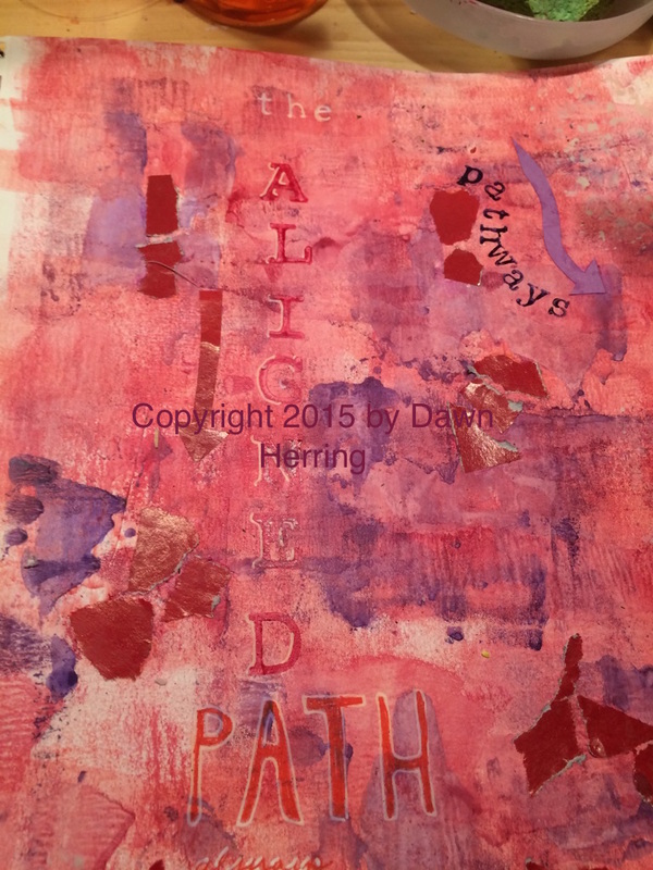 Once I had the question down, I knew I needed a conclusive message to sort of answer it...What I determined was...The Aligned Path Always Leads Home. Aha! (Pause for a Epiphany moment). It's funny. My word for 2015 has been Aligned. (Yes, I'm sharing a secret here.) So naturally the word came to mind in conjunction with pathways. And that was my concluding answer...and you know how I determined that? Due to life experience. When I'm aligned, I'm HOME. Everything just FEELS right. And I know when I'm not. And want to get realigned as soon as possible!! So I stamped out the "the" in white Uniball pen, then stamped Aligned with large alpha stamps in red watercolor and highlighted them with white pen. I then hand drew letters for PATH with white pen and filled them with red pen. I hand wrote "always leads" and highlighted with white pen. Then I stamped "home" with ink and alpha letters. I also had some fun cutting out Arrows from colored construction paper and adhered them in various spots around the Pathways showing different directions. But the concluding "Story" behind this spread is I always want to be Aligned becomes that's where I'm home. And it's very good. 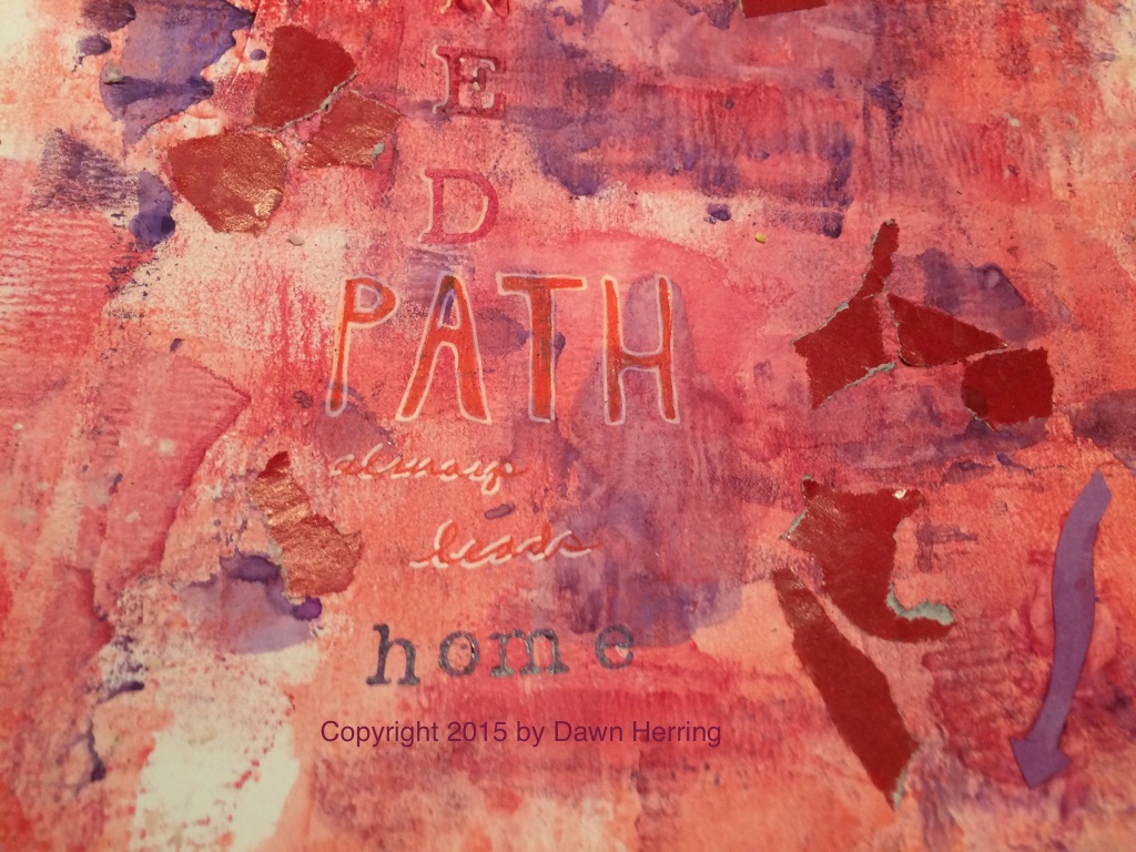 Journaling Prompt:
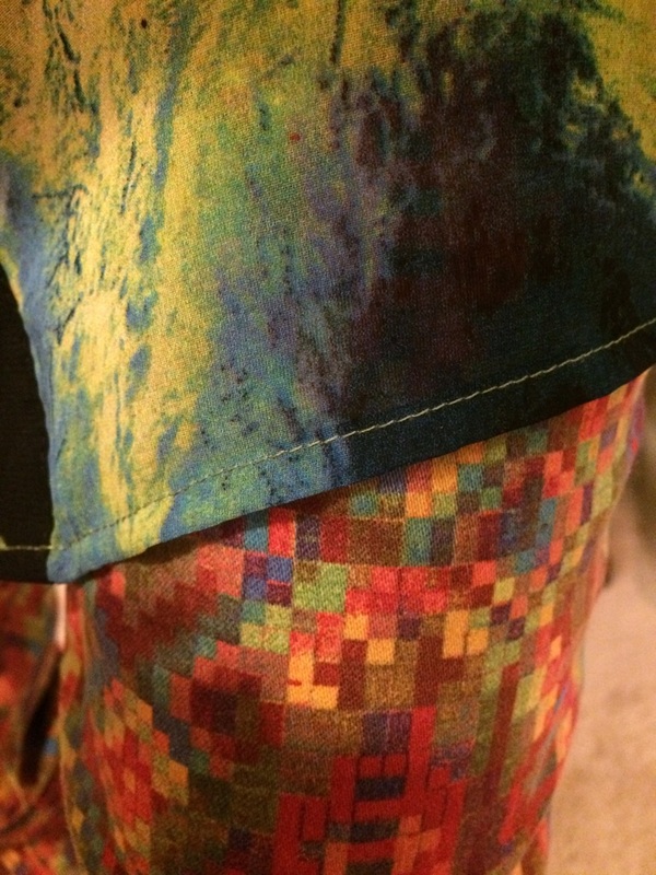
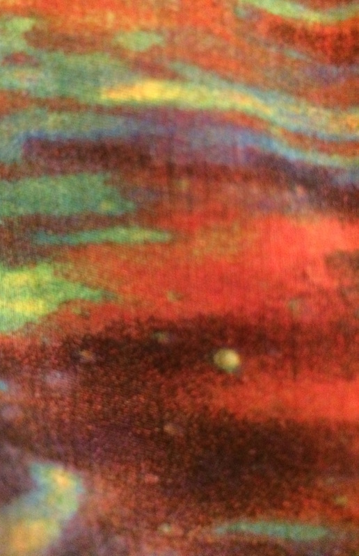
Do you know where your Aligned Path to HOME is? If so, detail what it feels like and looks like when you are there. Also describe when you know you're NOT aligned and the process you use to get realigned. Art Journal Prompt: Honor your HOME place in your art journal through images, text and maybe even colored arrows pointing to home using your favorite or associative colors that remind you of HOME. You can also use the word Aligned as a focal point. Copyright 2015 by Dawn Herring Copyright 2015 Art Journal Images by Dawn Herring Copyright 2015 Art by Dawn Herring  I always love it when I find something unexpected when I shop at my favorite stores. Several months ago I ran into some sock wear at Target that really caught my eye: Vibrant Colors and Patterns reigned! My artist self was gleeful at such inspiring accessories, I just Had to check them out. I decided to get just one pair just to see if I liked them and if they fit well. The orange slices was my first choice. What fun fabrics to add to my already-colorful wardrobe! I couldn't wait to find an outfit that would suit these socks just right. 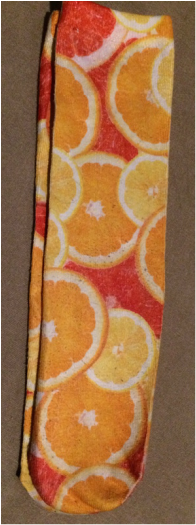 It didn't take long for me to find an appropriate day to wear them with my sneakers for my morning walk. Although it's hard to see them when I'm wearing long pants, when I take my shoes off, they are all in their colorful glory. But just knowing I had them on made me happy since I knew I was wearing my favorite colors, and I happen to have a painting I did with watercolors my first year of keeping an art journal and it features orange slices! (See image below!) After several wears, with these socks that are mostly polyester with a bit of stretch, I did notice a bit of pilling when they came out of the dryer. I think they do better when hung to dry. I also noticed that the top band that really holds the sock up is a bit tight and leaves an indention in the skin, but I found this to be a minimal issue. 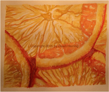 My Watercolor painting in my First Art Journal that my socks reminded me of. Copyright 2015 by Dawn Herring 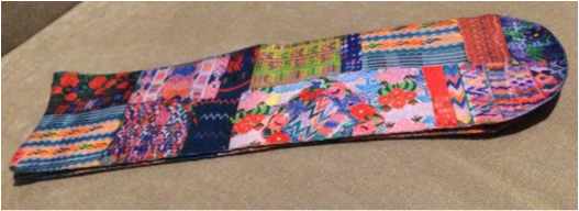 Full sock with patchwork pattern I purchased at Target on Clearance 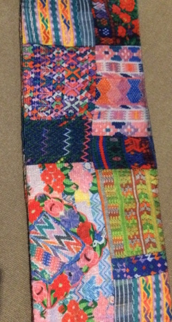 Detail of patchwork sock Detail of patchwork sock Several months after I purchased my first pair, I was back at Target and I saw that socks were on clearance, so I checked to see if those vibrant patterns were in the mix, and to my pleasant surprise, they were! And at a bargain price! Here was one pair I purchased that remind me of a patchwork quilt. The image above is the full sock and the one on the left is a bit larger for detail. Cute, huh? I love the designs all mixed up and with some of my favorite colors! These would probably fall into my "crazy wear" category of wardrobe finds which is just fine by me! I love the zig zag patterns and the flowers and the stripes, oh my! 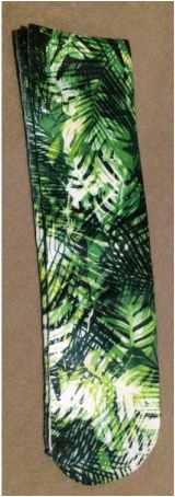 Full Leaves Sock I found on clearance at Target Full Leaves Sock I found on clearance at Target The socks featuring the leaves pattern to the left and below were also in the mix and I was really happy they were, since they would have been my second choice after the orange slices. I just love all the greens and the layers of leaves and it looks like the sun is shining through in parts. I love the way that looks on the trees in my front yard. That's probably why I like these so much. I couldn't wait to share with you these Fabulous Finds with vibrant colors that I love to wear and to paint with! It's so much fun to incorporate what I love into many dimensions of my life, honoring Who I Am as an Artist and Lover of Color. 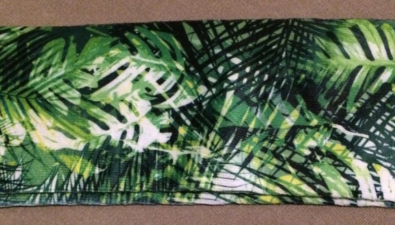 Journaling Prompt:
Do you find yourself purchasing items that inspire you in some way due to a feature that draws you and makes you happy even if all the elements of that certain something aren't perfect? Detail you latest find that fits this description and share why you choose to get this item even with its imperfections and how that makes you feel. Would you purchase that item again, knowing what you know about it? Art Journal Prompt: Use a page or spread in your art journal to showcase a recent purchase of something that truly honors Who You Are in any life dimension and include detail as to how it honors you and why you purchased it. You may want to mention any imperfections it may have. Copyright 2015 by Dawn Herring Copyright 2015 Header Image by Dawn Herring Copyright 2015 Photos by Dawn Herring Note: Fabric design is not my own. Special Thanks to the artist who created this design! The brand of socks featured in the post are Photoreal by Xhilaration. 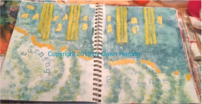
The Dividing Line Full Art Journal Spread Copyright 2015 By Dawn Herring
Welcome, Art Journal Enthusiasts! I have a new Art Journal Spread to share with you; I've titled it, The Dividing Line. This particular spread features Modeling Paste, home-made by me. I used a mix of gesso and baking soda, which can be really crumbly and messy if you don't use enough gesso to make it look like cement. This takes practice, messy practice. *wink*
My goal with this spread was to test out this home made-modeling paste to see how well it would work with a stencil, and this time I made a stencil of my own with long dividing lines. I knew pretty quickly I was going to use them across the top of the page, but I also decided ahead of time that I wanted to put some color down first since when I used modeling paste before without color on the background, I didn't like it as much. I used a brayer to lay down watercolor paint; this is the FIRST time I've used a brayer to lay down color. I have used brushes, sponges and even my fingers, but not a brayer. 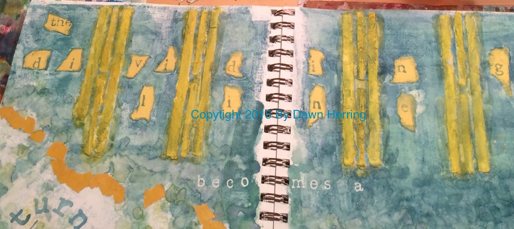
Up Close of The Dividing Line from Art Journal Spread Copyright 2015 by Dawn Herring
First tip with a brayer: always make sure it's clean before you use it! I had to put down many layers of watercolor before I was satisfied with the coverage. Plus the color was very washy, not thick and dry. (This is not acrylic paint, so there's a bit more effort put in since watercolor isn't opaque and takes more applications for good coverage.) But once I used the brayer, I found that I LOVED the textured look I got from using it, versus laying down color with a brush. Once I had the color down, then I applied the modeling paste with my hand-made stencil. Very messy procedure but I loved the result. That's when the name of this spread came to me, since the lines were creating divided space. So I decided to tear some good 'ole colored construction paper into pieces and stamped out the letters individually, then adhered them with matte medium. I later edged them with more watercolor; love that look.
UpClose of Modeling past area and Becomes a from The Dividing Line Art Journal Spread Copyright 2015 by Dawn Herring
As I filled in more of the space, It almost felt like a cliff with a dam of water both visually and viscerally, so I decided to emphasize a separation between the top of the page and the bottom. I tore some gold colored magazine pages into pieces and used those to create a division. I also used a small round sponge on a wooden stick to add more watercolor after I used the brayer and created lines of "water" coming down in a circular motion; as I did this, the idea of a turning came to mind. Then I realized the connection: The Dividing Line Becomes a Turning Point! Wow.
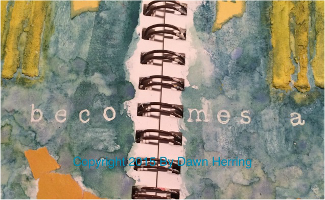
I absolutely love it when this happens; do you know why? Because when I play in my art journal, I gain understanding of myself and my life experiences, bringing the subconscious to the fore. The realization with this spread is a perfect example of what I mean. Once I had this idea solidly in mind, the rest of the spread just fell into place. From the application of the words "Becomes a" to the words, "Turning Point." For "becomes a", I used a white Uniball pen on stamps for the letters, reinforcing the letters with pen directly on the page for solid coverage. I LOVE the contrast of white on the darker bluish hue. It really POPS. 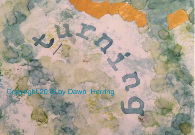
UpClose of Turning in "The Dividing Line Becomes a Turning Point" Art Journal Spread Copyright 2015 by Dawn Herring
For the "turning" word, I wanted it to express itself with its meaning, so I stamped it out in a turning manner. And for "Point," I wanted it to have a directness to it, so I included an arrow pointing at the end and highlighted the letters with my white Uniball pen. I also painted the dividing lines with a gold color. I love the contrast of the gold with the bluish hue.
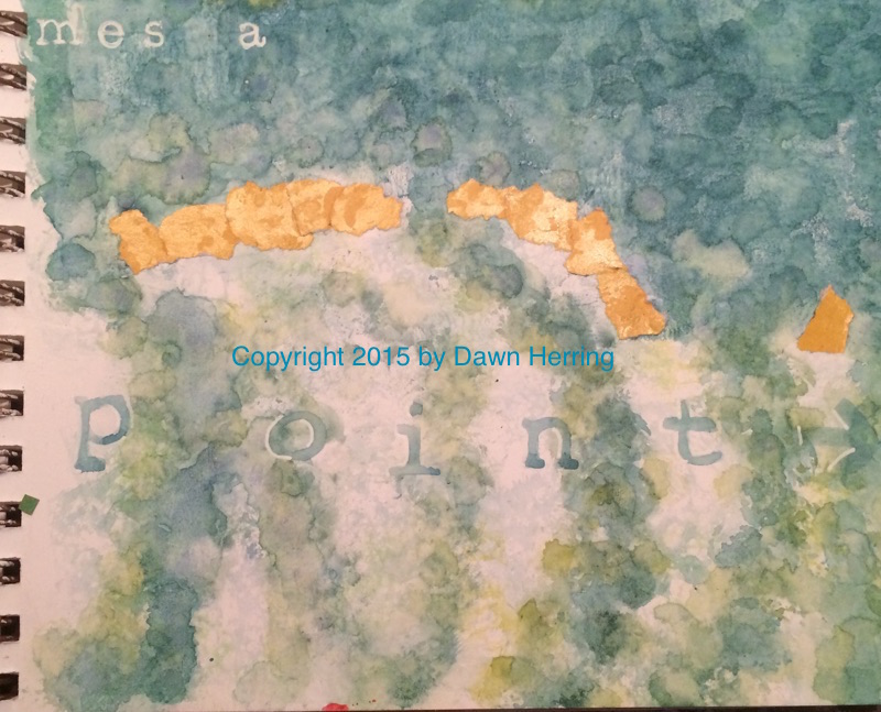
Up Close of Point in The Dividing Line Art Journal Spread Copyright 2015 by Dawn Herring
I really enjoyed the process of creating this spread, the realization of learning more about myself, about making decisions and how those decisions can become turning points toward authenticity. We all want to be authentic, don't we? Each decision we make can help us be more authentic than ever.
Sometimes when we face a life challenge, it can feel like a dividing line, especially when we determine to say NO to something we were once saying Yes to. But once we make that decision, knowing it brings us into our authentic path when we do, it becomes a turning point of truth in our lives. When we know the truth and live it, we are free, aren't we? Journaling Prompt: Have you recently experienced something that felt like a division or a change of direction for you? If so, detail it in your journal, including how you felt and responded to the realization that you needed to make a change of direction toward authenticity. Affirm your choice to Stay Aligned with Who You Are.
Art Journal Prompt:
Dedicate a page or spread to a recent decision you made, changing from YES to NO or from NO to YES; you may want to use the NO or YES as your starting point and stamp out the meaning behind the decision. Copyright 2015 by Dawn Herring Copyright 2015 Art Journal Images by Dawn Herring 
As a watercolor artist, I am always thrilled to find books with watercolor as the focal point, ready to learn, find insightful tips and travels in the wonderful world of this vibrant and fun medium. So when I ran across Watercolor From the Heart by Barbara Nechis, I thought it would be a great read...and it was!
The title drew me in with a focus on the Heart since I know from personal experience how valuable expressing yourself from the heart can be. (You can view my Refresh Daily Rewind Video on this subject.) In Watercolor from the Heart, Barbara shares her thoughts on her watercolor journey, including her past teachers, the rules she learned and finding her authentic watercolor path. I really enjoyed diving into her past experiences and into what she thought was valuable experience for her as an artist. She also shares about the watercolor techniques she found fascinating that enabled her to find her signature style of sorts: using water to create shapes and edges that are the foundation of her fabulous layered paintings, which often feature soft edges of flowers, landscapes and still lifes. Many images she takes for reference are also highlighted as she talks about the importance of observing and taking photos of places and things that fascinate and fill the creative well. She touches a bit on using other media with watercolor, such as gouache, crayon and pencil and offers some fascinating design elements as well. There are step by step examples of her watercolor techniques and also ways to take advantage of watercolor issues that arise and make the best of challenges. I really enjoyed the journey with Barbara and I admire her authentic path as a watercolor artist. Copyright 2015 by Dawn Herring Copyright 2015 Header by Dawn Herring
As an Amazon Associate, I earn from qualifying purchases.
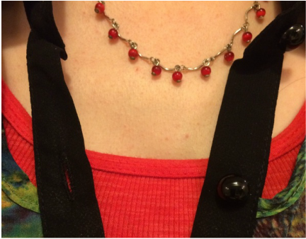 @2015 Image by Dawn Herring I also wanted to show how the main featured top has the cut outs by the collar, the red tank I layered with as well as the necklace I chose for the jewelry enhancement (an Avon selection gifted to me by my sister) of this particular outfit. I love red for its vibrancy so I wanted to accentuate the reds in the top with the tank and the necklace. I'm also wearing earrings that match the necklace not shown in the photo above.
Now it's YOUR TURN! Journaling Prompt: What kind of colors inspire you? Are they vibrant, bright and fun? Or are they more subdued, interesting and mysterious? Do you have these inspiring colors in YOUR wardrobe? What do these colors speak to you? What kind of action do they inspire in you? What Creative expression can you initiate with these colors? Art Journaling Prompt: Take the same colors that inspire you and feature them especially in your next art journal spread to honor your preferences and show what they speak to you, either in cut out letters, stamped quotes, or a doodle dedication to all colors that you love and why you love them. Remember to give yourself permission to try some new combinations in your wardrobe. You never know what will make you feel absolutely fabulous! @2015 by Dawn Herring @2015 Images by Dawn Herring @2015 Header by Dawn Herring  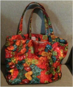 I wanted to share a Fabulous Find of mine that I had been looking for in the last couple of years. Yes, it took that long, considering how picky I am about design, color/fabric and price. For the past few years, I used a tote I purchased at Walmart for $10. You can see it at the left. It has a couple of pockets and a zippered section and the rest is all open. It worked well for me until I added a journal to the mix. Then it felt like chaos reigned in my purse! I seriously needed some organization. So I was on the lookout for a new handbag that would help me get organized--you know, a place for everything. I would notice handbags that stood out to me which pretty fabrics and larger sizes when out and about. I noticed the ones I liked the most were Vera Bradley bags. Then a friend recommended I sign up for Zulilly which hosts fabulous finds for great prices. So I signed up and waited patiently for Vera Bradely to be featured. Well, I FINALLY found what I was looking for! Yay! 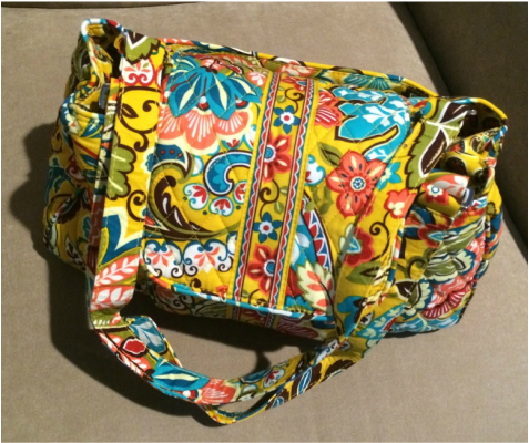 Again, I was picky about design, structure and price. I got this bargain for $30; it has sections to keep everything organized with zippered and pocket areas. It's absolutely perfect.
I wanted to emphasize to you the importance of honoring your preferences (based on whatever budget you follow, of course). I saw many bags with colors and patterns that didn't suit me. Here's a list of what I didn't want: Paisley Dark backgrounds No organizing sections Totes Backpacks Too small or too large Here's a list of what I DID want: Vibrant colors like turquoise, gold, orange, and reds Organizing sections with pockets Large florals It does take patience to find what you want when you're picky like me, but I still found it and now that I have it, it was worth the wait. Honoring your preferences is a way of appreciating yourself for Who You Are and What You Love. And not thinking you should like what everyone else is buying. Sometimes what you love may be hard to find. Keep looking until you hit the jackpot! Then Celebrate! Journaling Prompt: List the qualities of something you really like that you've been looking for. Get as detailed as possible and express why these qualities are important to you. No detail is too silly or minor or dismissed. The more, the better! This is a way to see deeper into who you are and why you like what you like. Art Journal Prompt: Get an image or draw an image of what you are looking for right now and use it as a focal point in a journal spread. Cut out words or doodle the qualities you love about what you want. And when you get it, celebrate with another spread focusing on your happiness and how you feel now that your desire has been met. Copyright 2015 Dawn Herring Copyright 2015 Images by Dawn Herring 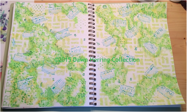 Refreshing Friends Full Art Journal Spread I am especially excited to share this Art Journal Spread with you since it has special meaning to me. I went out on a limb, so to speak, several weeks ago on Facebook and asked my Friends what kind of impression I left with them. I asked for one word (or more if inclined). I was not disappointed. Instead, I was humbled and pleasantly surprised with what my Friends shared. After receiving such a lovely response, which just thrilled my heart, I decided I would need to create an Art Journal Spread to Commemorate the Occasion! Life is worth celebrating and this particular experience was no exception! So I made a list of all the Friends who responded along with the words they used to describe me. I was smiling and feeling loved and appreciated during this process! 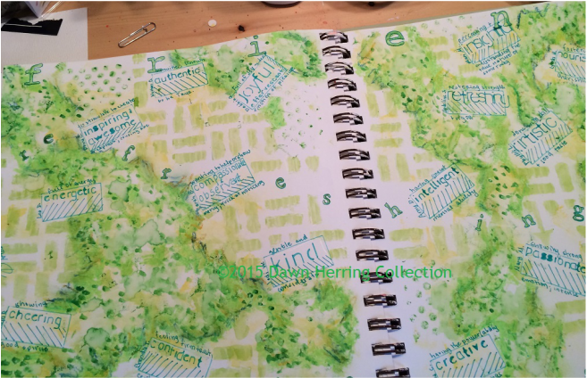 Up Close of "Refreshing" word stamped from Refreshing Friends Art Journal Spread After I made my list, I primed my 2 page spread with gesso. Then later I decided to use a cosmetic sponge and lay down some watercolor paint in varying green hues and yellow. As I applied it, I felt the impression of creating a garland of sorts, the kind you see hanging around doorways during the holidays, with Gift Tags attached. At least, that was my goal. I used a rectangle stencil to create boxes drawn in marker in varying spots throughout the spread. I filled in each box (using a stencil) with the descriptive word, then I wrote the definition of the word outside the box on top and underneath. Then I wrote the name of each person who offered each descriptive word. (This entire process felt so validating...I'm so used to talking about validating yourself from the inside out...now it was from the outside to me!) . 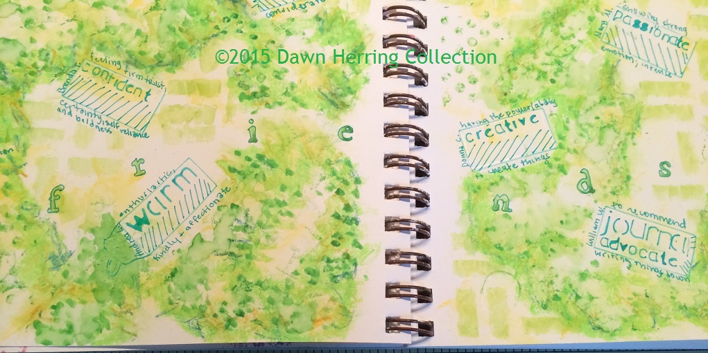 Up Close of "Friends" stamped in Refreshing Friends Art Journal Spread Once I had the boxes filled in, I added more watercolor in dots to give it a bit more texture. I also later added some oil pastel. I used my large and medium sized alpha stamps to create the words "refreshing friends" as well as the word FRIENDS in all caps on the side and lower case across the top of the spread. Obviously Friends was my theme, and my Friends Refreshed me! So that made perfect sense to put it all together that way. I added a new stencil in the back ground to give it some contrast, which I liked. I also added some outlining to the letters with white gel pen and green marker. At one point, I added a bit of water to some of the paint, creating a washy effect which I also liked. I was pleased with the final product and dated and signed it finished. 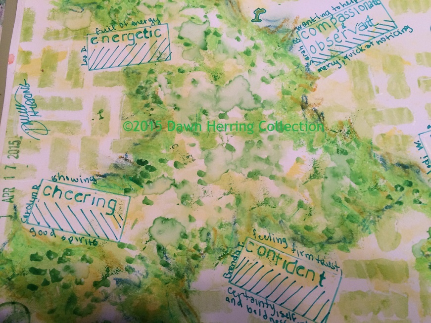 Up Close of watercolor wash and descriptive boxes in Refreshing Friends Art Journal Spread Art Journal/Journal prompt:
We all have refreshing friends, don't we? Or maybe you don't know how rich you are with refreshing friends and need to reach out to find out! It takes courage to ask friends to share how they feel about you and what impression you are making in the world. It felt risky to me, that's for sure. But was a lovely surprise it was! So, take the time to ask your friends what impression you leave on them. You may want to write a journal entry about what impression you want to make and see how those responses from your friends either validate what you wrote or maybe opened things up in ways you didn't expect! You may also want to create an art journal spread, in whatever fashion that pleases you, honoring your preferences, to commemorate the friend occasion. You can also do a mind map on the word friends as well as the words they use to describe you and see what associations come up. I find this particular journaling technique very telling, with repetition of words, patterns, etc., that arise. I do want to give a special shout out to my friends who are featured in this spread who were kind enough to share their time and their kind words of appreciation toward me just because I asked! Here are those friends by name: Mary McCarthy, Donna Crim, Jodi Whisenhunt, Mari McCarthy, Andrea Lewis, Lynda Monk, Sarah Joyce Bryant, Phyllis Garlock Lardieri, Carolyn Ratliff, Amy Ahrens Dench, Bill Weeks, Madeline Sharples, Nathan Ohren, Donna Carrick, and Cate Russell-Cole. Also thanks to Christina Katz, for her encouragement for my risk-taking. :) Here's the status box from Facebook. Thanks for taking the time to read this post; that also means a lot to me, that you take the time to see what I have to say. YOU are a friend too! That reminds me of the theme song to the Golden Girls, Thank you for being a Friend. :) Copyright 2015 Dawn Herring Copyright 2015 Images by Dawn Herring Collection 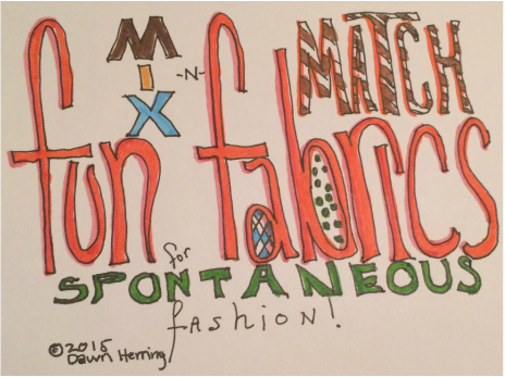 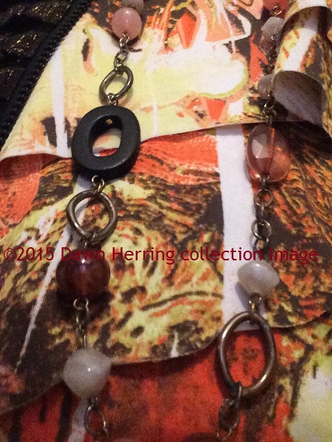 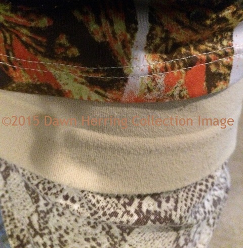 I have 4 layers showing a Juxtaposition of color and pattern from my wardrobe that I pieced together. As you may already know, Refresh Daily is my artistic blog showcasing my artsy point of view in every life dimension that I enjoy sharing. So I've decided to share some of my wardrobe choices, which will, of course, include some of what I call my "Crazy Wear," which pertains to some of the wardrobe pieces I love that have lots of vibrant color and fun fabric choices when put together. So this is my first blog post featuring my Fun Fabrics and today's Juxtaposition features four layers. (My idea of juxtaposition is when I put two elements together that seem to contrast each other and yet, at the same time, seem to compliment each other uncannily.) Just a note: There has been a fabric trend going on in the fashion industry for several years now where seemingly contrasting patterns are being put together, so I saw that as permission to try stuff that might not be typical, sort of like an outside-the-box wardrobe choice. And, boy, am I having FUN with this! The top layer that's a bit darker so you may not see it clearly is the dark brown jacket I'm wearing to top of the wardrobe choices. (You can also see a smidge of it in the second image on the left side.) Got this jacket at Cynthia Elliot Boutique several years ago. The next layer is the one with orange as the predominant color. It's a sleeveless tank with several layered frills which you can see more clearly in the image below. I think this is my favorite sleeveless dressy top since it contains many of my favorite colors, orange, yellow, brown and tan and the design element is simply fab. I got this piece at Khol's several years ago. But what I love about this piece is how it contrasts in a fun way to the bottom layer of the pants I'm wearing, which features Vera Wang's Princess Collection which I also purchased at Khol's a couple of years ago. I am a huge fan of print pants. I love the possibilities of what I can do with print on print. I think the tie-in of design visually for me with the sleeveless top and the print pants is the predominant design with the brown hue. They somehow seem to go together for me. I think this combo is one of my favorites. (You can see this most clearly in the first image.) The layer between them is a tan tank I purchased at Cynthia Elliot Boutique about a year ago. The tank gives a reprieve of sorts from the juxtaposition of fabric designs between the sleeveless blouse and the pants. Sort of like a tie-in, if you will, that pulls it all together without visual overwhelm. I also wanted to share a visual of the necklace I often wear with this top, also a piece I purchased at Kohl's many years ago. I love this necklace since it combines wood, metal and beads in very cool earthy colors. I can wear it long, like I'm doing here, or I can wrap it twice for wearing just on the neck. I think it also ties in the fabrics with the color scheme for one fab look.
Do you enjoy mixing and matching fabrics for a fun combination? Do you have any Crazy Wear pieces that make you feel fun and fab? I think the element I love the most about my wardrobe choices is that I can wear my favorite colors and honor myself as Artist in what I choose to wear. Folks often tell me that I dress like an Artist. I see that as a huge compliment! So, don't be afraid to mix things up a bit, try something new that just looks and feels good to you. Honor Who You Are by referring to your preferences. Take a pic to commemorate the occasion. (I did want to mention that my 21 Day Refresh Intensive includes a Wardrobe Element that is just plain fun!) I always find myself inspired when I see other folks dressing in Fun Fabrics and vibrant colors, both women and men! So perhaps what I've shared here will inspire YOU. @Copyright 2015 Dawn Herring |
Dawn HerringDawn engages in many roles: As Writer/Blogger and Artist/Creative and Founder of Refresh with Dawn Herring: Where Art and JOY Align, She enjoys sharing from her vast experience as award-winning, life-long artist and leader in the field of written journaling, offering encouragement and proven tips to other journal keepers. Dawn's focus is on written journal keeping, artistic expression and finding your Creative Voice, and positive change that leads personal empowerment, encouraging you to leave your authentic and positive mark in the world. Dawn is a Commercial artist, hand letterer/illustrator and writer/blogger and enjoys sharing insights, humor, and encouragement as she shares from her life experiences as a woman, wife, mother of two grown daughters and as a Grandparent to a special needs grandson. She enjoys keeping a journal and reading spiritual texts to help keep the light on. May JOY Align with Your Creative Heart. Archives
August 2019
Categories
All
|
 RSS Feed