|
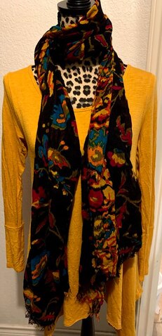
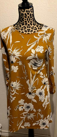
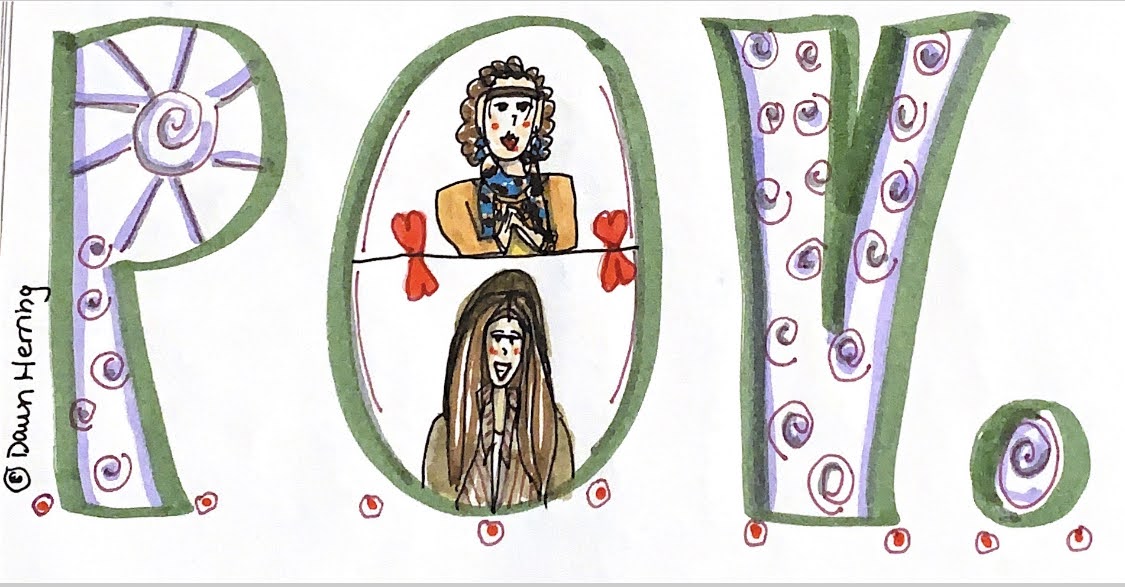
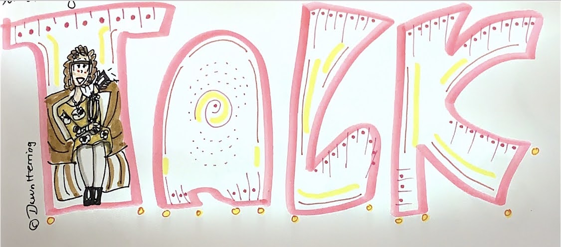
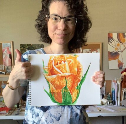
Hello friends! Welcome back to The Sweet Spot, where we focus on all things Essential, Simple and Satisfying! In this post, I’ll be focusing on Color, Fashion, Journaling and Art. But first, a bit of back story. I am a member of The Joyspotter’s Society Facebook Group headed by Ingrid Fetell Lee who authored the book, Joyful (You can read my review here). I really relish the joyful focus in this group and the different “themes” Ingrid creates each week for us to focus on for inspiration. Recently, she suggested posting with the color yellow as the theme, which was a really fun choice. I ended up sharing an image of the yellow section of my wardrobe (see below). Yes, I recently arranged my wardrobe based on color rather than type of garment, which makes for some new mixing and matching—so fun! Since I was so inspired by this theme, I decided to create a blog post with the color Yellow/Gold as my focus. Isn’t that fun? Yes, being inspired by Ingrid’s theme, I thought I’d share how the color yellow/gold inspires me, why I love it so much, and share some pieces of my wardrobe with you and why those pieces work for me. I also decided to include some journaling tidbits, since back in December of 2019, I began using a Bullet journal. (Yes, I have expanded my journaling practice once again!) One of the Collections I have included in the past few months has been recording what I wear each day, just to keep track of the color scheme. I happen to also draw these fashions on my cartoon each night when I create my doodle, so that theme connected rather readily. In the past couple of months, I even created a tracker chart in addition to writing down what garments I wore (abbreviated for ease of use) ; this tracker is now color coded so when I look at the chart, I can see visually what colors I have worn the most in the month. Color has a vibration and energy to it, so I found the idea fascinating to track the colors I am drawn to intuitively as I choose my garments each day. It really is a multi-layered aspect of the "why" behind my choices: the color, the vibration, my sense of fashion, and how I feel when I’m wearing what I choose, Doing this in my narrative journal would have been difficult which is why I appreciate the Bullet Journal approach to making this aspect of my life visible. As an artist, color is really important to me, in what I create and in what I wear. So, YELLOW. I prefer to use the word Gold, since I really love the darker hue versus the light hue of yellow. Both of the garments I’m featuring in the post are of the darker variety. One is solid gold and one is gold in the negative space around a large floral motif in black and white. The reason I really love the solid color is twofold: I don’t have a lot of solids in my wardrobe (I happen to be drawn to motifs and multi-color palettes) and it’s easier to mix and match with a print scarf, which you can see in the image above, The other garment with the floral motif is very comfortable with a perfect circle neck, and the floral is larger with the contrast of black and white, which really suits my style. These garments are my favorite pieces of fashion from my yellow/gold section of my wardrobe. In addition to sharing images of my actual wardrobe pieces, I decided it would be fun to share examples of my fashion illustration in my cartoon doodle. I found two doodles, one with each of the garments featured above so you can see how I’ve incorporated my love of these pieces in my drawings. In the floral garment, I’m sitting in my bedroom chair talking on my phone with a loved one. In the solid gold garment, I’m chatting with my eldest daughter about an important subject. I really enjoy doing these drawings that show my perspective, my emotion and my relationships and what they mean to me. And it’s a fun challenge to draw what I’m wearing during these times in my life. If you want to see the Bullet Journal Collection for my wardrobe, you’re welcome to watch the video! The color Yellow/Gold is a fun color to wear since it’s vibrant, giving that “sunny” aspect to life. My favorite flower is the SunFlower which goes right along with that essence. I also use the color yellow consistency in almost everything I paint, including the Rose I’m sharing below. My two favorite watercolor choices are Winsor Yellow and Yellow Ochre. Yellow is so essential, making other color “light up” in vibrancy. It really livens things up and raises your vibration. Thus my Ode to Yellow/Gold and all it holds for me. I trust you enjoyed my perusal with the color yellow as well as my fashion focus both with garments and my cartoon illustrations. I have so much FUN with these aspects of my life. They are Essential to my way of looking at and experiencing life on a daily basis. It’s part of Honoring Who I am and relishing what makes me happy.
What is essential for you right now? What colors are you drawn to? Do you keep a bullet journal and if so, what collection really makes you happy and adds fun to your life? You’re welcome to share below! I’d love to hear from you! Remember to Keep It Sweet, focusing on what is Essential, Simple and Satisfying—especially in this New Year of 2021.
0 Comments
Leave a Reply. |
Details
AuthorHi. I'm Dawn Herring. Here at The Sweet Spot I love writing about how I'm keeping it sweet with music, song writing, cartooning, doodling, watercolor painting, movie watching and book reading. My goal is to share what feels really sweet to me and why. Perhaps it will inspire you to do the same. Archives
February 2022
Categories
All
|



 RSS Feed