|
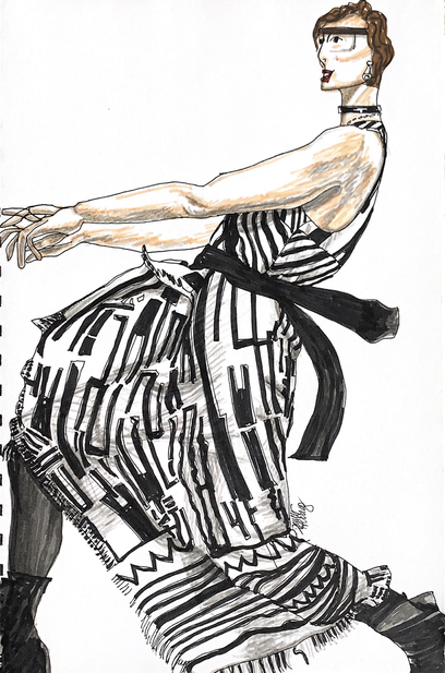
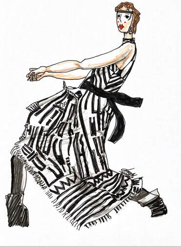
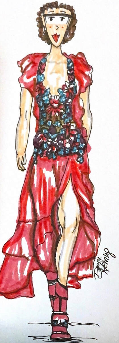
Welcome back to The Sweet Spot where we focus on all things Essential, Simple and Satisfying! And for me, Experimenting with my Approach to a sector of my Art has taken CENTER STAGE, which is very exciting for me. It’s so important to expand our Creative Horizons to see what we’re capable of! And have Loads of FUN in the process! Anytime I’m working with the Dynamics of FASHION (which has been an interest of mine for decades!), I find it immediately engaging. In the past few posts, I’ve been sharing my exploration of combining fashion illustration and cartooning. You can view my Illustrative Sketches from my first post here, and Part 2 is here. And if you’re curious to see my sketches of a family member in dance ensembles, go here. I am back with a new Fashion Illustrated Cartoon Sketch as I continue my exploration and experimentation with pen, watercolor markers and dynamic designs I’m drawn to, All while emphasizing my new-found skill in cartooning; not as a funny comic but as a way of illustrating day to day life, only with a focus on new wardrobe possibilities! Why not “try on” some new options for “size” visually? Sort of like using a virtual try on room only through illustration. Yes, it’s fun! ☺️ Ok, so, I’ve had the resourced image for this garment stashed in my drawer for Years. I finally pulled it out with combining the fashion illustration and cartoon approach and thought it would be fun and challenging. The black and white design drew me in immediately as well as the pose “in motion” in which the model was engaged. My first decision was to replace the head with my cartoon version. The face was an Immediate challenge since I usually draw it like a portrait with it fully forward. This was almost a profile but not quite. But I managed to portray without too much a-do. The arms positioning was a fun but challenging aspect of this dynamic posture. It reminded me of the finger position of this family member in ballet pose. The garment itself self along with the dramatic creases based on the figure’s pose was fun to create (using varying grays and dynamic strokes to create the illusion of depth. The actual black design with white negative space was super fun to follow with my India ink Fabre Castell Pitt Artist Pens, then using my Tombow marker to fill the larger areas of black. Then there was the fringe along the edges, a combination of applying grays, carefully placed black marks, to emphasize the negative aspect of white. The whole process of seeing what works with my tools and their application is truly dynamic and fun for me. And seeing the result, even as just an experimental sketch (This is not final artwork), is truly Satisfying and motivates me to keep going and see what else would be Fun and Dynamic to try! For this 3rd experiment with a Fashion Illustrated Cartoon, the drawing I rendered the first time was on a larger scale, filling the sketchbook page from side to side. The other two (linked above) were smaller in size. So I decided, for this one, to do two renderings instead of one, making the second closer in size to my typical illustrated cartoon I do each evening. So, yes, I drew the dress twice! It was fun the second time around, since the marks had already been created with the first drawing. I simply repeated the pattern I had already done for the second mini version, so it didn't take as long. I used the same approach with pens and markers for shading and depth. I was a bit more "sketchy" with the boots since this is not final artwork, just experimental. This experiment, with both drawings, shows me where where I can improve as far as proper form of the figure goes. Not trying to be exact since this is a more sketch-like approach with cartooning in mind.
Since I have many years of experience with contour drawing of models in dynamic fashion (all the way back to the 1980’s-yes, I’m dating myself 😉), it’s easy to fall more toward realism as opposed to cartoon drawing. Perhaps it’s a little bit of both. 👀 (Maybe more cartoon-like with the second drawing, more like the size of my daily illustrated cartoon doodle.) I’m enjoying this foray into these new combinations to see where it will take me. Using limits and, yet, expanding my horizons at the same time. It feels good. It satisfies. And it’s enabling me to grow as an artist in these areas that interest me, which is essential for my Creative Well Being. So, how are you growing your Creative Horizons? Any curiosities you want to follow? Anything inspiring you to try something new? Share in the comments below so I can cheer you on! Let’s create and discover those Sweet Spots together and see where it leads us; it just might make each of our worlds and the world overall a happier, more colorful and joyful place.
0 Comments
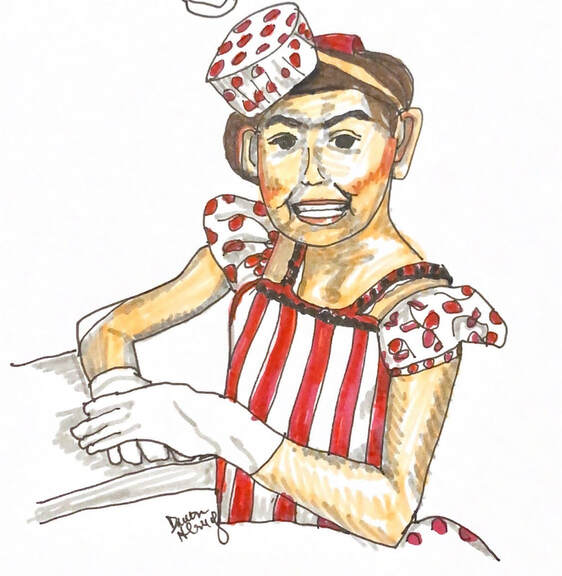
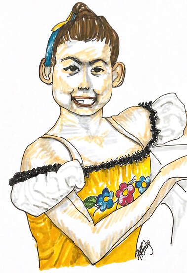
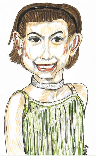
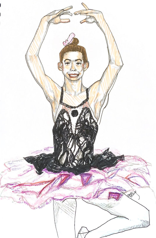
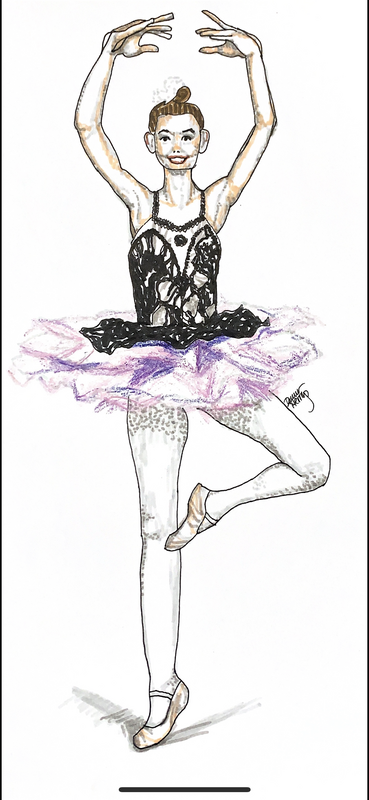
Hello friends, and welcome back to The Sweet Spot, where we focus on all things Essential, Simple and Satisfying! I'm excited to share more ARTSY related stuff since I've been doing a LOT of Experimenting. For me, experimenting gives me space to follow my curiosity, expand my horizons and try new things that interest me. Following the Question: Would I like to try that? is hugely motivating, especially if the answer is yes! In this post, I plan to share with you my most recent venturing into what I'm calling my illustrated cartoon journey. But a little recent history first: Back in 2020, I learn how to draw myself as a cartoon and do so each evening in my illustrated cartoon doodle, which you can check out here. Then I decided to try my hand at doing a cartoon style portrait of each of my daughters, which you can view here. Then I decided to try my hand at combining myself in cartoon with fashion illustration of garments not in my own wardrobe which I did here and here. I have been having so much fun with all this cartoon illustrating! It's definitely been a Sweet Spot for me for sure! Then just a bit ago, I pulled out a small photo album filled with photos of my two nieces, daughters to my one and only older sis. (Permission given by her to share the drawings of one of her daughters below. :)) I started to peruse them and decided to try my hand at drawing an illustrated cartoon version of my younger niece who is a dancer, and has been taking tap and ballet since she was young and still going strong in high school. I consider all the drawings below as sketched experiments, not final artwork. I use permanent India ink pen when drawing the contour as well as the color for the details. I also used some watercolor markers for the hair. Since ink is not erasable, there are lines that I had to adjust/correct, so these are by not means perfect. But so fun!! I decided to start with the youngest image with her dressed in a tap dance costume with stripes and polka dots, which I thought was the cutest! I really enjoyed the whole process of drawing the details of the garment and accessories as well as rendering her face as accurately as possible without going into too much detail; after all, it's considered a illustrated cartoon version. For the above image of her in floral with gold background with black lace detail, I took the same approach. I used India ink and some watercolor markers to render this older image of my niece. My goal was to do several of her based on age, from younger to older. In the above image with my niece in a green flapper style dress, I went a big larger with her face, so this is almost a portraiture in illustrated cartoon style. By this third experiment, I was getting more comfortable with the skin highlights and using the right lightness of grey for shadow purposes. With the two above drawings of my niece in her most recent ballet assemble, we jumped a few years in time! I was so impressed with the beauty of her form, I decided to do two cartoon illustrated renditions of her ballet images. The first was more close up for more detail and the 2nd was so I could include the whole figure. They look similar in size side by side, but the first one is larger than the second one. It was good experience to experiment with both sizes and working with the details in both. I would say my biggest challenge was rendering the hands with such dramatic positioning of the fingers. In addition to the India ink and watercolor markers/pens, I also added some oil pastel in lavender, pink and purples since I didn't have proper paler colors in my markers for this rendering. I simply sketched the tulle portion of her ballet skirt with pale grey. This entire experience was invaluable to me of rendering another family member in this illustrated cartoon approach! Each drawing teaches me something new. Plus with the repetition of drawing the same face, I build muscle memory, so each time it gets a little easier. One of my future goals is to eventually draw the figures and faces without a black outline. I have yet to try this with my evening doodle cartoon, so I'm thinking that may be the best place to start. But, we'll see. I've seen some portraiture approaches with just flat marker color, starting with a light base, adding a medium base for more definition with parts of the face, then a darker base for even more shadow work for depth and dimension; then using pen for all the fine details. I haven't tried that approach just yet, but am looking forward to the open possibility! Experimenting is prime for me right now as I make my way in the illustration and cartooning world with which I'm having so. much. fun. As always, I'll keep you up to date with my latest ventures so you can follow along with me. Art is one of my most Essential Activities that brings me Simple Pleasure and Deep Satisfaction. What is most Essential, Simple and Satisfying for you right now? Drop and comment and do share! I'd love to hear from you! Let's Keep It Sweet together and make this world a better, happier (and saner) place. Wishing you ALL the SWEETNESS. <3 P.S. All drawings are Copyrighted to Dawn Herring, 2021.
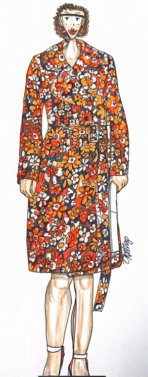
Hello friends! Welcome back to The Sweet Spot where we focus on all things Essential, Simple and Satisfying. For the past two posts, I've focused on my illustrated doodle cartoon and combining that with Fashion Illustration, where I illustrate fashion from other imaged sources aside from my own wardrobe. I have always enjoyed fashion illustration from a young age, mostly with contour drawings in my younger years. But since I have been using Markers and Pens for my evening doodle, I have translated my love of fashion illustration into cartoon format and have such fun doing so! I recently tried my hand at combining my cartoon with a multi colored floral dress design which you can see here. I just completed my second try at this new combination, this time with a belted floral coat of sorts. The original color scheme for this piece was lighter than what I used, more like pink and orange pastels. But, since I don't have those colors readily available in my art supply stash, I went with a bit of a bolder color scheme with darker pinks and deeper oranges, which suit me just fine. It does give it a lot more pop than the original. Not sure which color scheme I like better, but, to keep it SIMPLE, I went with the colors I had. Usually I try to match things as closely as possible for a more aligned image, but this time, I chose to simply go with what was in hand. And be okay with that. I'm not really into pastel colors, although I do have a lighter purple in my stash that I use a lot. Vibrant colors are usually my go to, which, if you've followed me for any length of time, you know it's what I create with and what I wear, for that matter! In my first attempt, which you can see here, the drawing of the dress is smaller is size. This 2nd attempt is broader with the shoulders and pattern. I'm still trying to decide if the cartoon head should have started out a bit bigger. But once it's drawn in ink, it's permanent. It's often in retrospect that I see what I could have done better. But, alas, this IS an Experiment and I'm having a delicious time with the process.
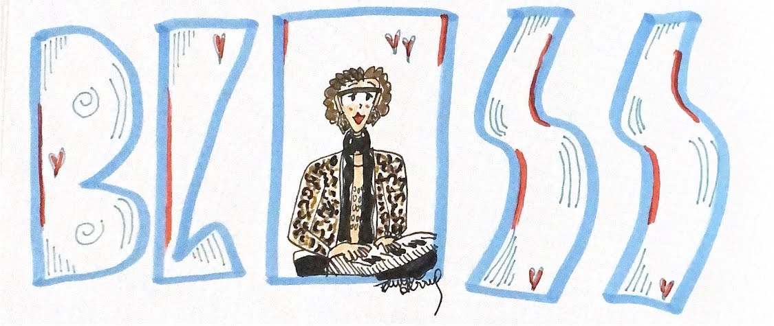
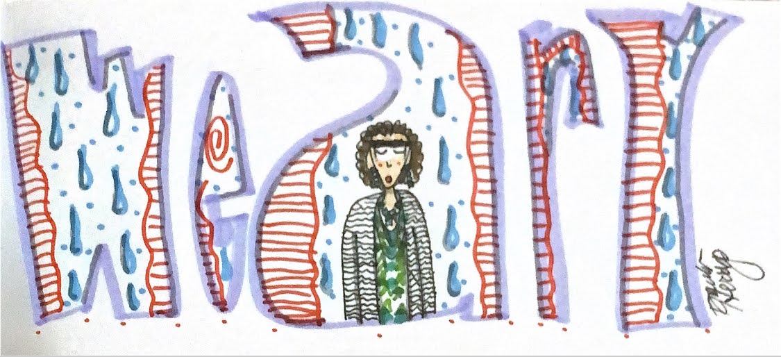
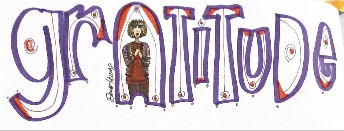
I always start the drawing with the head and move to the contour of the garment right from the shoulders. So placement is key for sizing. If the shoulders are drawn too wide, then the whole garment will be broader. Every drawing for me is a learning experience. I'm still proud of my work and my efforts to expand my artistic horizons. Would I draw this again to make the proportions more accurate? No, probably not. Moving on to the next thing with new knowledge is the way I'm most likely to go. This is a very busy pattern of mixed florals. I really love larger motifs like this and the contrast between the white detail and the varying mixed color palette. Would I wear this? Probably not. I would choose a less busy pattern personally, but it was a fun challenge to draw. This approach to fashion (a combination of cartoon and illustration is pen and marker) is a work in progress and it's fun to see the choices I make as far as images I'm drawn to each time. Art really does equal awareness: of what I like, the color patterns, the motifs I enjoy, the size of the detail and design, the layers I incorporate as I draw and "Paint" the colors to accentuate shadow and depth. To me, art is a gift. No matter how you apply it. Creation is all about paying attention to what you love and what you care about. And using creation as a way to express yourself. Give yourself that gift in whatever form is Sweet for you! Thanks for sharing in my artistic journey! I wish you all the Sweetness! Welcome back to The Sweet Spot! I share all things Essential, Simple and Satisfying in my life with the purpose of showing what a difference it can make to be mindful of these elements. As I recognize what is Satisfying to me, I want to do more of it. When I see what is Essential for me, I want to be sure I make space for it. When something gets too complicated for me, I want to find strategies to make it simple and do-able. For this post, I plan to share a bit of my cartoon doodle art (and the history behind my process), which is something I create on a daily basis in the evenings. I started off about 8 or 9 years ago, when I used a word to summarize my day, and took up a challenge to create a doodle a day for 7 days and used that word as my source for the doodle. Well, I guess you can say, I never stopped! I was having so much fun creating doodle designs, I just wanted to keep going with it. It was fun and inspiring and a relaxing way to end my day. Once I started using markers and pens to bring color into the. mix, then the sky was the limit! Winsor Newton watercolor markers, Tombows, and Faber Castell Artist Pitt Pens came into the mix, for detail, full color, highlights and designs. I found myself using dots, circles, Lines and spiral motifs repeatedly since that's what I used in my paintings as well. I just go with whatever comes to mind. It's a very intuitive process that delights my Artist Self. As I mentioned in a previous post, Illustrated Doodle Cartoon, where I share my recent foray into fashion illustration from an outside resource other than my wardrobe, I greatly desired to learn how to draw myself in cartoon form. I've wanted to do this since high school! Over the years I looked for instruction through different books on cartooning, and I finally found one that suited me with a step by step. After several months, I began to create a cartoon that resembled me somewhat and have improved it with facial expressions (eyebrows really do make a difference!), and work on the figure (which is a work in progress!). Of course I do all of this in pen, so NO ERASING. My work is all free-hand. There are times when I really like the result. Other times, not so much. I've learned what to draw first so it looks naturally layered with no lines interfering with other illustrated parts. I just go with the flow and learn from my perceived "mistakes". I'm having so much fun with it! It is truly a Satisfying engagement for me as an Artist. When I first began my evening doodle, I just used black and white. So I was purely focused on the design aspect of filling in the letters and creating a doodle that looked like what the word meant. I even read a book on the subject to learn various letter designs to try and incorporate the feeling of the its meaning. Once I added color, I was still outlining in black pen. Several years ago, I decided to draw with colors for the outline of the letters, eliminating always outlining in black pen, and that really made a difference in the way the doodle looked. Brighter, more intuitive, and lively. So, now I always start with color. I rarely just draw the doodle outlined with black pen. When I entered my cartoon into the mix, I drew with black pen from the start and still do. I fill each cartoon with go to colors for skin and hair, plus adding design elements for the wardrobe, such as lines for stripes. I try to capture the motif design as much as possible without making it too complicated. When I draw the fabric, I don't reference the garment in front of me. I just go by memory. I think back to what I wore that day and just run with it. One thing I want to point out. When I started this doodle process, it was just for fun. In black and white. Adding color came almost 2 years later. Drawing with color instead of black pen even later still. Adding my cartoon has been a recent venture in the past year and a half. All these elements took time to develop and include in my daily art practice. Not all at once.
So, if you're looking to create a routine with an art form, keep it simple right from the beginning. Simplicity is key to trying something new. And if you run into something, a new idea, that feels right, try it, with no expectation for the outcome. And if it works, run with it and see how long it keeps your attention and satisfaction. Change things up if that's what suits you. Be patient with yourself if it doesn't turn out "right" every time. Practice is key, especially daily practice. I look forward to creating my illustrated cartoon doodle each evening. It always relaxes me and gives me space to practice design elements, cartoon form, illustration, and overall capturing of what matters to me in my day. Essentially, it's a visual colorful diary in addition to my evening written reflection. It shows my ups and downs and keeps me in the know of how I'm doing. In other words, it's relevant to me on a daily basis. It holds meaning that I feel is important to myself as an Artist, a Creative, a Family member, a Business Partner (with hubby), an emerging musician (Just learning to play piano!), and female human. I trust you have enjoyed this foray into my illustrated cartoon doodle journey and my goal is to inspire you in your creative pursuits, whatever they may be. Just remember to keep it Essential, Simple and Satisfying to creative as many Sweet Spots in your daily life! Wishing you all the Sweetness! Welcome back to The Sweet Spot where we focus on all things Essential, Simple and Satisfying! I’m excited to have something new to share in my artsy world! A little back story is in order, to give you some context to my new venture. Last year I decided I wanted to learn how to draw a cartoon of myself. After many months of practice, I began adding this cartoon to my evening doodle dressed in my daily wardrobe pick ( the doodle consists of a word drawn in large letters that summarizes my day’s experience with fun designs inside the letters). I draw one letter a bit wider to make space for my cartoon, and I illustrate what the word means for me. I started doing this months ago (not sure how many!) and an idea came to my mind in the spring to try my hand at illustrating fashion not in my wardrobe by referencing an image from a magazine and use my cartoon as a starting place, so she would be wearing it! Even at a young age, I’ve always been fascinated by fashion illustration. I used to look at newspapers back in the day in the ARTS section to find them and copy them as practice. Now, Drawing my own wardrobe each evening on my cartoon is a fun way to incorporate my fashion focus in a doable format that is fun, colorful and satisfying. So, when the idea came to me to use my cartoon to draw fashion from magazines, I thought, why not try it? It could be fun and doable as well. So I did! Below you can see the image of my first attempt at fashion illustration mixed with my cartooning. I’m excited to expand my artsy experience to include more of what I love and to stretch my skill and have fun doing it! For this illustration, I simply started with drawing the head like I do with my doodle cartoon each evening. Then it was a matter of sketching the outline of the fashion piece in black marker (I use Faber Castell Pitt Artist Pens in India ink). Once I had the garment drawn with as much detail as possible, I then filled it with color! I used a combination of Winsor Newton watercolor markers, Tombow markers and Pitt Pens as mentioned for detail. I love layering colors, which helps give the illusion of depth, transparency, and texture (oh, how I adore texture!!). I wasn’t overly concerned with being anatomically correct with the figure itself; I just sketched my best and had fun. I’m super pleased with how this first attempt came out and plan to do more. It was fun getting in the zone with my illustrative focus on fashion, which never seems to get old, even as I get older! I love it when I get ideas for trying something new to expand my artistic horizons, especially when they align with my overall goals as an artist, this case being illustration, combined with cartooning, fashion, and layering color and adding detail. It’s essentially a win-win-win! What is Essential for you right now that brings Satisfaction and keeping it Simple at the same time? I encourage to pursue what you’re curious about and follow your JOY. You’re welcome to share below in the comments what’s working for you to express yourself in a way only you can. Because your voice matters! Wishing YOU All the Sweetness! All images copyrighted to Dawn Herring 2021
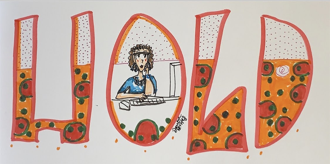
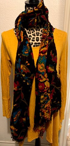
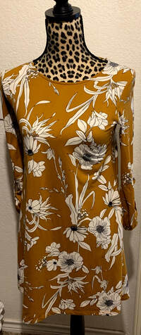
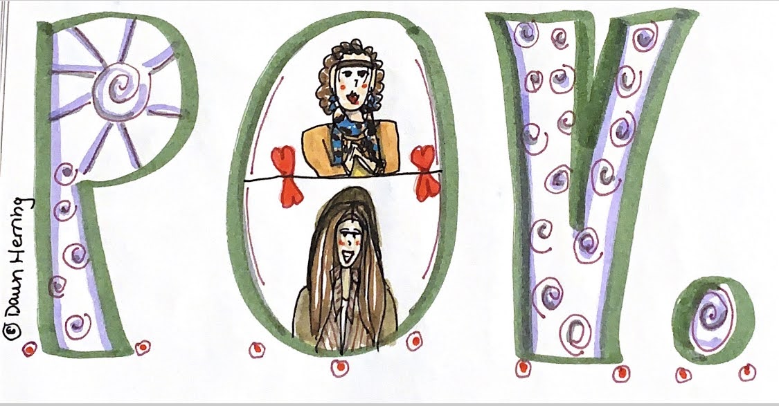
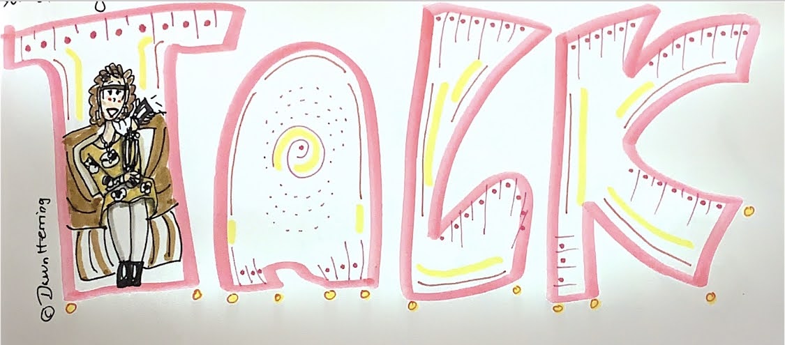
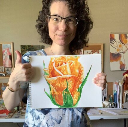
Hello friends! Welcome back to The Sweet Spot, where we focus on all things Essential, Simple and Satisfying! In this post, I’ll be focusing on Color, Fashion, Journaling and Art. But first, a bit of back story. I am a member of The Joyspotter’s Society Facebook Group headed by Ingrid Fetell Lee who authored the book, Joyful (You can read my review here). I really relish the joyful focus in this group and the different “themes” Ingrid creates each week for us to focus on for inspiration. Recently, she suggested posting with the color yellow as the theme, which was a really fun choice. I ended up sharing an image of the yellow section of my wardrobe (see below). Yes, I recently arranged my wardrobe based on color rather than type of garment, which makes for some new mixing and matching—so fun! Since I was so inspired by this theme, I decided to create a blog post with the color Yellow/Gold as my focus. Isn’t that fun? Yes, being inspired by Ingrid’s theme, I thought I’d share how the color yellow/gold inspires me, why I love it so much, and share some pieces of my wardrobe with you and why those pieces work for me. I also decided to include some journaling tidbits, since back in December of 2019, I began using a Bullet journal. (Yes, I have expanded my journaling practice once again!) One of the Collections I have included in the past few months has been recording what I wear each day, just to keep track of the color scheme. I happen to also draw these fashions on my cartoon each night when I create my doodle, so that theme connected rather readily. In the past couple of months, I even created a tracker chart in addition to writing down what garments I wore (abbreviated for ease of use) ; this tracker is now color coded so when I look at the chart, I can see visually what colors I have worn the most in the month. Color has a vibration and energy to it, so I found the idea fascinating to track the colors I am drawn to intuitively as I choose my garments each day. It really is a multi-layered aspect of the "why" behind my choices: the color, the vibration, my sense of fashion, and how I feel when I’m wearing what I choose, Doing this in my narrative journal would have been difficult which is why I appreciate the Bullet Journal approach to making this aspect of my life visible. As an artist, color is really important to me, in what I create and in what I wear. So, YELLOW. I prefer to use the word Gold, since I really love the darker hue versus the light hue of yellow. Both of the garments I’m featuring in the post are of the darker variety. One is solid gold and one is gold in the negative space around a large floral motif in black and white. The reason I really love the solid color is twofold: I don’t have a lot of solids in my wardrobe (I happen to be drawn to motifs and multi-color palettes) and it’s easier to mix and match with a print scarf, which you can see in the image above, The other garment with the floral motif is very comfortable with a perfect circle neck, and the floral is larger with the contrast of black and white, which really suits my style. These garments are my favorite pieces of fashion from my yellow/gold section of my wardrobe. In addition to sharing images of my actual wardrobe pieces, I decided it would be fun to share examples of my fashion illustration in my cartoon doodle. I found two doodles, one with each of the garments featured above so you can see how I’ve incorporated my love of these pieces in my drawings. In the floral garment, I’m sitting in my bedroom chair talking on my phone with a loved one. In the solid gold garment, I’m chatting with my eldest daughter about an important subject. I really enjoy doing these drawings that show my perspective, my emotion and my relationships and what they mean to me. And it’s a fun challenge to draw what I’m wearing during these times in my life. If you want to see the Bullet Journal Collection for my wardrobe, you’re welcome to watch the video! The color Yellow/Gold is a fun color to wear since it’s vibrant, giving that “sunny” aspect to life. My favorite flower is the SunFlower which goes right along with that essence. I also use the color yellow consistency in almost everything I paint, including the Rose I’m sharing below. My two favorite watercolor choices are Winsor Yellow and Yellow Ochre. Yellow is so essential, making other color “light up” in vibrancy. It really livens things up and raises your vibration. Thus my Ode to Yellow/Gold and all it holds for me. I trust you enjoyed my perusal with the color yellow as well as my fashion focus both with garments and my cartoon illustrations. I have so much FUN with these aspects of my life. They are Essential to my way of looking at and experiencing life on a daily basis. It’s part of Honoring Who I am and relishing what makes me happy.
What is essential for you right now? What colors are you drawn to? Do you keep a bullet journal and if so, what collection really makes you happy and adds fun to your life? You’re welcome to share below! I’d love to hear from you! Remember to Keep It Sweet, focusing on what is Essential, Simple and Satisfying—especially in this New Year of 2021. |
Details
AuthorHi. I'm Dawn Herring. Here at The Sweet Spot I love writing about how I'm keeping it sweet with music, song writing, cartooning, doodling, watercolor painting, movie watching and book reading. My goal is to share what feels really sweet to me and why. Perhaps it will inspire you to do the same. Archives
February 2022
Categories
All
|











 RSS Feed