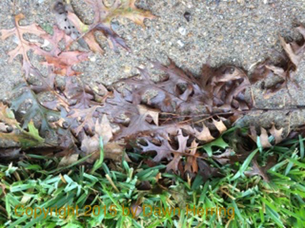
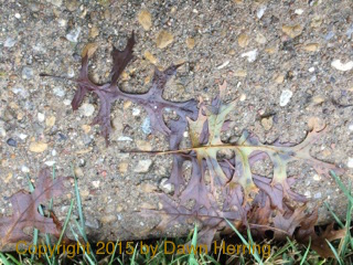
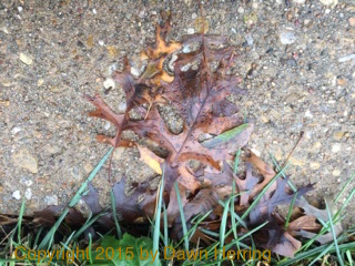
 This is my favorite leaf image from that morning's venture, with so much layering mixed with grass. Copyright 2015 by Dawn Herring I wanted to share with you, my dear readers and friends, about an experience I had on my walk recently. I go on almost daily walks, weather permitting, for fresh air, exercise and for any adventures that may come my way, which I am always on the look out for. During this particular morning, I was seeing evidences of the deluge of a rainstorm from the previous night--very windy with downpours. Typical Texas weather, of course. So as I was journeying down the sidewalk, then crossed over for my way back to my place, I noticed the sidewalk plastered with leaves in a particular area. Apparently the tree on the nearby property took a bit of a beating and lost a bunch of its glory onto the sidewalk. At first, I just glanced, noticed the textured and layering and then kept walking. But then I realized I could be missing out on something by not taking more careful note of what I was seeing. I believe this was an intuitive impulse I was feeling.
I am a huge proponent of listening to your intuition; it will often guide you into some unexpected places that you would otherwise miss, enriching your daily life experience. And I certainly didn't want to ignore this impulse--I didn't want to miss out on anything I may not be aware of. So I took a U-turn on foot and retraced my steps. It's not often that I do this, but this time I felt compelled. 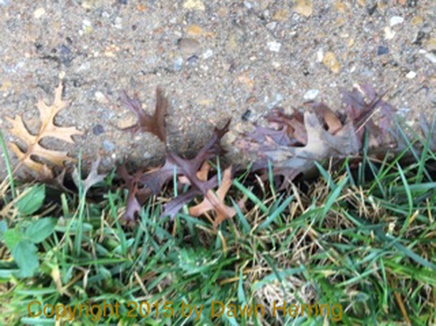 Look at all that texture and color! Copyright 2015 by Dawn Herring 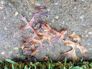 I love the browns and reddish gold colors here. Copyright 2015 by Dawn Herring I love the browns and reddish gold colors here. Copyright 2015 by Dawn Herring So I got my camera ready and started taking up-close shots of various areas where the leaves were congregating. I really enjoyed this process, being careful to really pay close attention to the color, the shapes, the layered effects of the leaves, and the mixed texture of leaves against grass and sidewalk with the colored stones mixed in.
In reality, for me, this was a fun filling-of-my-creative-well since, as an artist, I am always looking for images, textures, color and design for future reference in my creative work, especially with my watercolor paintings. You can never know where that infilling will lead. I really do need to trust this process, so I divulged myself and seized the moment. And I'm so glad I did. I really saw this as an important lesson of recognizing those important nudges and not ever overlooking the smallest of creative impulses or opportunities to see what something could mean for me in any way possible. I followed my curiosity and enjoyed the process of absorbing the moment of unexpected creativity. And honestly, I think maybe the leaves were happier because they gave me such pleasure which gave them even more value, off the tree and in places they might not particularly enjoy very much. (Most times I'm sure they just get stepped on and not noticed, especially in such an environment.) I know it may seem odd to give what would be perceived as dead leaves with no life in them whatsoever personality and good thoughts. But when it comes to appreciating the beauty all around me and what it has to offer my creative expression, I think it's worth the good energy-based thoughts to what I come across to induce gratitude for the unexpected. What we think really can make a difference in how we feel. And when we act on those intuitive impulses, we can more greatly experience the JOY of Being Alive. And that can give us the fuel to more readily and effectively leave our meaningful mark in the world. Journaling Prompt: Have you had an experience where your intuition gave you an impulse to do something you might not otherwise do? Did you follow it? If so, you were glad you did? What difference did it make for you? Would you do it again? Art Journal Prompt: Using the words, Intuitive Impulse, showcase visually a time when you enjoyed something special because you listened to the Voice within and followed your curiosity. Honor that process and the fact that you listened.
0 Comments
Here is my latest Periscope Refresh with Dawn Herring Broadcast where I talk about the elements of My Creative Practice, which includes journaling, art journaling, doodling, watercolor painting, and walks. And I talk about the importance of doing something you love every single day.
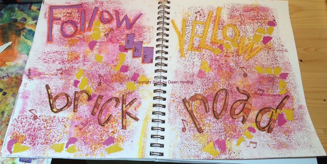 Follow the Yellow Brick Road Full Art Journal Spread Copyright 2015 by Dawn Herring Hello, Art Journal Friends. Today's featured spread, Follow the Yellow Brick Road, had an interesting start. I recently got my hands on a different kind of bubble wrap from a package containing a book that I used. I applied watercolor to one side and then applied the paint on the wrap to the page with a brayer. And--whalla! Lovely, colorful texture! I applied this on repeat with several colors: red violet, yellow, and violet. 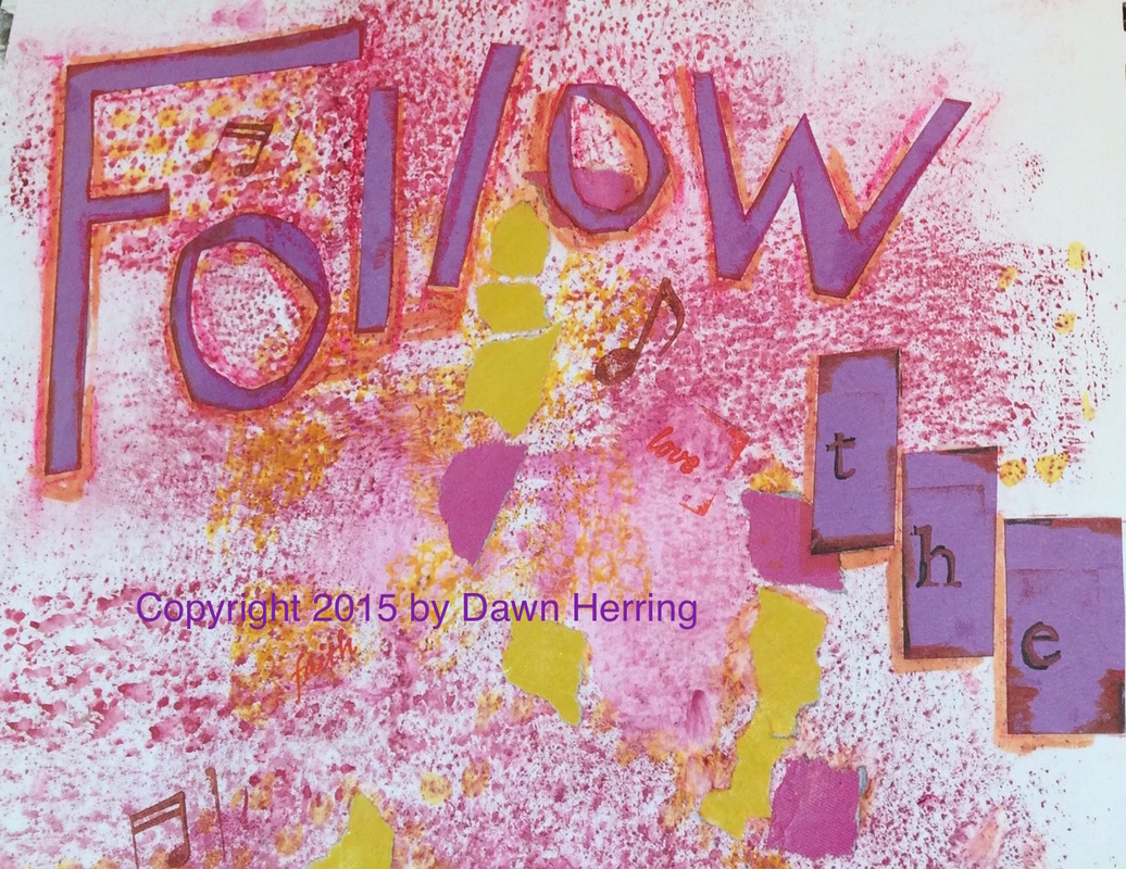 Up Close of "Follow the" of the spread, Follow the Yellow Brick Road Copyright 2015 by Dawn Herring Once I had those layers down, I found some magazine pages with yellow and violet colors, tore them in bits and adhered them with matte medium. Once I had that down, I had to give this beginning some serious thought. I didn't have a "message" come to me right away. But once I came back to it, I eyed the "path of yellow" created by the torn bits of collage and it reminded me of the Yellow Brick Road in the Wizard of Oz. Aha! I now had my message: Follow the Yellow Brick Road! 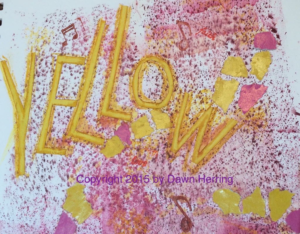 Up Close of "Yellow" from Follow the Yellow Brick Road Art Journal Spread Copyright 2015 by Dawn Herring Once I knew this, I went to work/play on how I would display each word. The words, Follow and Yellow, I cut out free hand from colored construction paper. I love the long, exaggerated letters. I then adhered them with matte medium in a random fashion. Once the letters were down, I used oil pastel to bring out the edges and highlight them. I also cut out rectangles of purple and stamped each one with a letter to spell "the." I also highlighted the letters with pen. 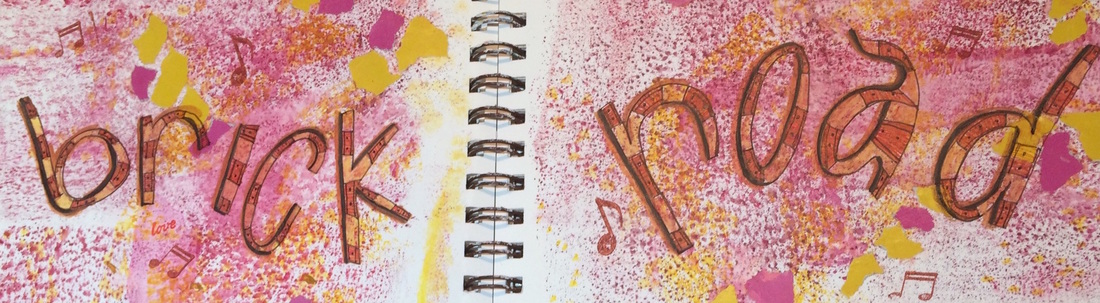 Up Close of "Brick Road" from Follow the Yellow Brick Road Art Journal Spread Copyright 2015 by Dawn Herring Then I got to work on the words Brick Road, and I knew I wanted to do my own lettering with Uniball Pen. I love doodling in my evening journal entry, so I applied my same lettering techniques here, adding lines to each letter and alternating the colors. I added black dots to every other space to create bricks in the letters. I also accented the letters with a black brush pen to give them a bit of shadow for more pop on the page. I added musical notes and other stamped words to enhance to purpose of the spread. I did want to say a word about the message behind, Follow the Yellow Brick Road. The thing that stood out to me the most about it was the difference between when being able to recognize when the road you are traveling leads to HOME or if it's a situation where you feel you've been confused by an illusion. And when you realize it was an illusion, it's as if you've seen behind the "curtain" to what's really there, and it's a true disappointment. Yet, the silver lining is what Glenda the Good Witch told Dorothy, "You've had what you needed all along." What I say is this: The Truth Comes From Within. And you will always find the Truth if you are seeking it, even if you have to get past Illusion to find it. Journaling Prompt:
Can you remember a time where you felt like you were on a yellow brick road and how what you thought it would lead you to was an Illusion? How did you reckon with this discovery? Were you disappointed? Where you relieved to discover it when you did so you could get past it? How has it impacted you in your life today? Art Journal Prompt: Create Your Own Yellow Brick Road and show where it led you and where you are now. Honor your path by validating how you felt at that time and how you have responded to the Truth you have discovered since. You can use map pieces to create a travel perspective as a background visual. The purpose of this video, Creative Curiosity, is to encourage the pursuit of curiosity paths to enhance your creative practice. I include journaling and art journaling prompts. I'm coming from my Dawn Herring Collection Art Studio where I sit to paint with watercolor to share with you my thoughts on curiosity and where it can lead to help us build a Creative Practice worth keeping.
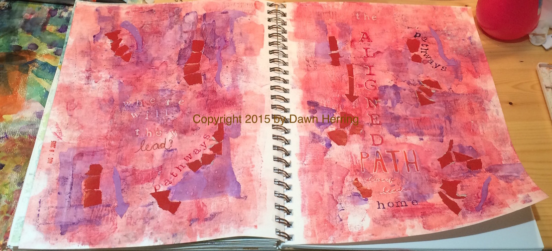 Pathways Full Art Journal Spread Copyright by Dawn Herring This art journal spread, Pathways, took me on a colorful pathway with reds and purples. Since my previous spread worked out so well with using a brayer to apply watercolor paint to the page, I decided to continue this trend yet again, applying layers of red washes. When I applied the purple hues, I used a palette knife for more focused areas and controlled application. Once I had that done, I accentuated the areas of paint with torn bits of magazine paper in red I had stashed and applied them with matte medium. This created areas or sections on each side, and they reminded me of pathways that lead to different places. Thus, Pathways, became my focus. That's when I determined to stamp out the word pathways along two of those sections, one on each side, using red and purple paint. 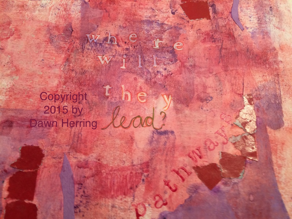 As I considered the issue of Pathways and what ones are in my life right now, (this is what happens as I'm creating an art journal spread: it opens pathways of thought and brings subconscious ideas to the fore and that's when I learn something about myself; always worth the time invested). As I considered my next step in this spread, I began to think about what this message could be teaching me right now. In this process, I determined to stamp out the question: Where will they lead? I used my Uniball white pen on stamped letters and the wrote the word, Lead, with Uniball pens in different colors. I also outlined the white letters with red pen. 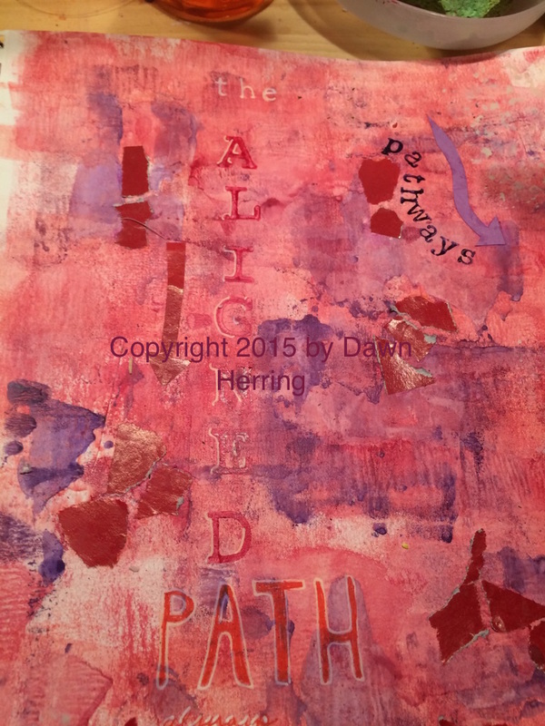 Once I had the question down, I knew I needed a conclusive message to sort of answer it...What I determined was...The Aligned Path Always Leads Home. Aha! (Pause for a Epiphany moment). It's funny. My word for 2015 has been Aligned. (Yes, I'm sharing a secret here.) So naturally the word came to mind in conjunction with pathways. And that was my concluding answer...and you know how I determined that? Due to life experience. When I'm aligned, I'm HOME. Everything just FEELS right. And I know when I'm not. And want to get realigned as soon as possible!! So I stamped out the "the" in white Uniball pen, then stamped Aligned with large alpha stamps in red watercolor and highlighted them with white pen. I then hand drew letters for PATH with white pen and filled them with red pen. I hand wrote "always leads" and highlighted with white pen. Then I stamped "home" with ink and alpha letters. I also had some fun cutting out Arrows from colored construction paper and adhered them in various spots around the Pathways showing different directions. But the concluding "Story" behind this spread is I always want to be Aligned becomes that's where I'm home. And it's very good. 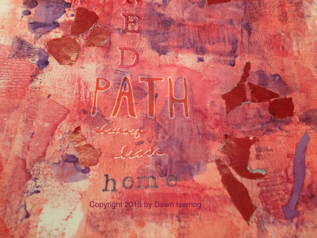 Journaling Prompt:
Do you know where your Aligned Path to HOME is? If so, detail what it feels like and looks like when you are there. Also describe when you know you're NOT aligned and the process you use to get realigned. Art Journal Prompt: Honor your HOME place in your art journal through images, text and maybe even colored arrows pointing to home using your favorite or associative colors that remind you of HOME. You can also use the word Aligned as a focal point. Copyright 2015 by Dawn Herring Copyright 2015 Art Journal Images by Dawn Herring Copyright 2015 Art by Dawn Herring 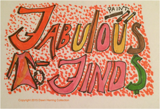 I always love it when I find something unexpected when I shop at my favorite stores. Several months ago I ran into some sock wear at Target that really caught my eye: Vibrant Colors and Patterns reigned! My artist self was gleeful at such inspiring accessories, I just Had to check them out. I decided to get just one pair just to see if I liked them and if they fit well. The orange slices was my first choice. What fun fabrics to add to my already-colorful wardrobe! I couldn't wait to find an outfit that would suit these socks just right. 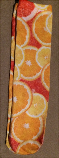 It didn't take long for me to find an appropriate day to wear them with my sneakers for my morning walk. Although it's hard to see them when I'm wearing long pants, when I take my shoes off, they are all in their colorful glory. But just knowing I had them on made me happy since I knew I was wearing my favorite colors, and I happen to have a painting I did with watercolors my first year of keeping an art journal and it features orange slices! (See image below!) After several wears, with these socks that are mostly polyester with a bit of stretch, I did notice a bit of pilling when they came out of the dryer. I think they do better when hung to dry. I also noticed that the top band that really holds the sock up is a bit tight and leaves an indention in the skin, but I found this to be a minimal issue. 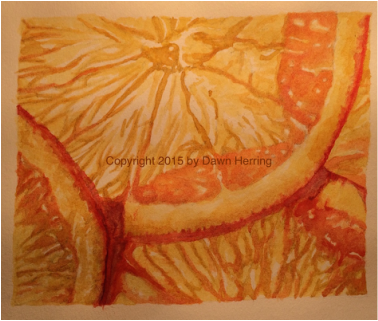 My Watercolor painting in my First Art Journal that my socks reminded me of. Copyright 2015 by Dawn Herring 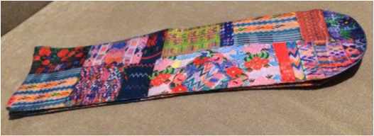 Full sock with patchwork pattern I purchased at Target on Clearance 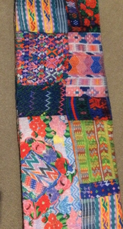 Detail of patchwork sock Detail of patchwork sock Several months after I purchased my first pair, I was back at Target and I saw that socks were on clearance, so I checked to see if those vibrant patterns were in the mix, and to my pleasant surprise, they were! And at a bargain price! Here was one pair I purchased that remind me of a patchwork quilt. The image above is the full sock and the one on the left is a bit larger for detail. Cute, huh? I love the designs all mixed up and with some of my favorite colors! These would probably fall into my "crazy wear" category of wardrobe finds which is just fine by me! I love the zig zag patterns and the flowers and the stripes, oh my! 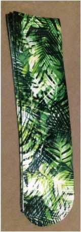 Full Leaves Sock I found on clearance at Target Full Leaves Sock I found on clearance at Target The socks featuring the leaves pattern to the left and below were also in the mix and I was really happy they were, since they would have been my second choice after the orange slices. I just love all the greens and the layers of leaves and it looks like the sun is shining through in parts. I love the way that looks on the trees in my front yard. That's probably why I like these so much. I couldn't wait to share with you these Fabulous Finds with vibrant colors that I love to wear and to paint with! It's so much fun to incorporate what I love into many dimensions of my life, honoring Who I Am as an Artist and Lover of Color. 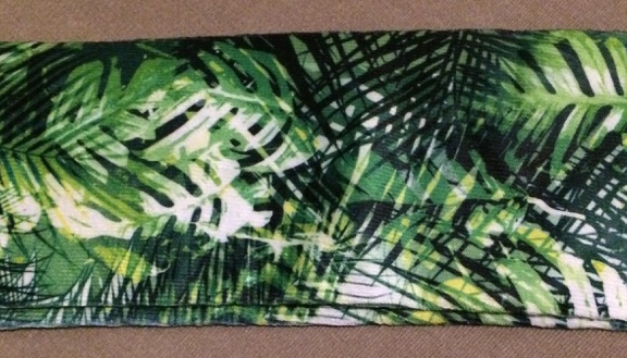 Journaling Prompt:
Do you find yourself purchasing items that inspire you in some way due to a feature that draws you and makes you happy even if all the elements of that certain something aren't perfect? Detail you latest find that fits this description and share why you choose to get this item even with its imperfections and how that makes you feel. Would you purchase that item again, knowing what you know about it? Art Journal Prompt: Use a page or spread in your art journal to showcase a recent purchase of something that truly honors Who You Are in any life dimension and include detail as to how it honors you and why you purchased it. You may want to mention any imperfections it may have. Copyright 2015 by Dawn Herring Copyright 2015 Header Image by Dawn Herring Copyright 2015 Photos by Dawn Herring Note: Fabric design is not my own. Special Thanks to the artist who created this design! The brand of socks featured in the post are Photoreal by Xhilaration.  The purpose of this installment of my Refresh Daily Rewind video series is to encourage the enjoyment of the creative process without the feeling of overwhelm due to our concern about how much we are producing. Gentleness and Relishment are key to creativity.
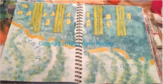
The Dividing Line Full Art Journal Spread Copyright 2015 By Dawn Herring
Welcome, Art Journal Enthusiasts! I have a new Art Journal Spread to share with you; I've titled it, The Dividing Line. This particular spread features Modeling Paste, home-made by me. I used a mix of gesso and baking soda, which can be really crumbly and messy if you don't use enough gesso to make it look like cement. This takes practice, messy practice. *wink*
My goal with this spread was to test out this home made-modeling paste to see how well it would work with a stencil, and this time I made a stencil of my own with long dividing lines. I knew pretty quickly I was going to use them across the top of the page, but I also decided ahead of time that I wanted to put some color down first since when I used modeling paste before without color on the background, I didn't like it as much. I used a brayer to lay down watercolor paint; this is the FIRST time I've used a brayer to lay down color. I have used brushes, sponges and even my fingers, but not a brayer. 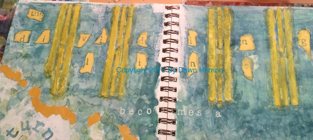
Up Close of The Dividing Line from Art Journal Spread Copyright 2015 by Dawn Herring
First tip with a brayer: always make sure it's clean before you use it! I had to put down many layers of watercolor before I was satisfied with the coverage. Plus the color was very washy, not thick and dry. (This is not acrylic paint, so there's a bit more effort put in since watercolor isn't opaque and takes more applications for good coverage.) But once I used the brayer, I found that I LOVED the textured look I got from using it, versus laying down color with a brush. Once I had the color down, then I applied the modeling paste with my hand-made stencil. Very messy procedure but I loved the result. That's when the name of this spread came to me, since the lines were creating divided space. So I decided to tear some good 'ole colored construction paper into pieces and stamped out the letters individually, then adhered them with matte medium. I later edged them with more watercolor; love that look.
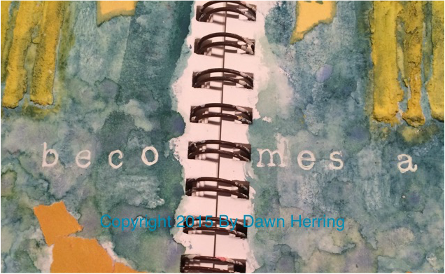
UpClose of Modeling past area and Becomes a from The Dividing Line Art Journal Spread Copyright 2015 by Dawn Herring
As I filled in more of the space, It almost felt like a cliff with a dam of water both visually and viscerally, so I decided to emphasize a separation between the top of the page and the bottom. I tore some gold colored magazine pages into pieces and used those to create a division. I also used a small round sponge on a wooden stick to add more watercolor after I used the brayer and created lines of "water" coming down in a circular motion; as I did this, the idea of a turning came to mind. Then I realized the connection: The Dividing Line Becomes a Turning Point! Wow.
I absolutely love it when this happens; do you know why? Because when I play in my art journal, I gain understanding of myself and my life experiences, bringing the subconscious to the fore. The realization with this spread is a perfect example of what I mean. Once I had this idea solidly in mind, the rest of the spread just fell into place. From the application of the words "Becomes a" to the words, "Turning Point." For "becomes a", I used a white Uniball pen on stamps for the letters, reinforcing the letters with pen directly on the page for solid coverage. I LOVE the contrast of white on the darker bluish hue. It really POPS. 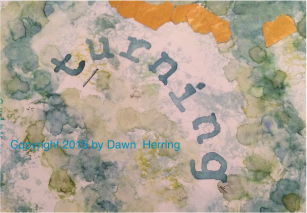
UpClose of Turning in "The Dividing Line Becomes a Turning Point" Art Journal Spread Copyright 2015 by Dawn Herring
For the "turning" word, I wanted it to express itself with its meaning, so I stamped it out in a turning manner. And for "Point," I wanted it to have a directness to it, so I included an arrow pointing at the end and highlighted the letters with my white Uniball pen. I also painted the dividing lines with a gold color. I love the contrast of the gold with the bluish hue.
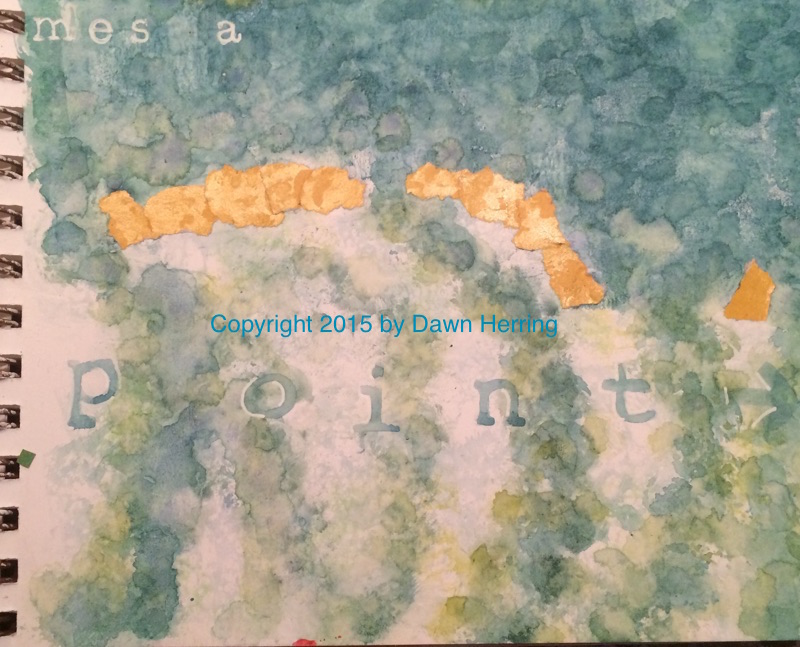
Up Close of Point in The Dividing Line Art Journal Spread Copyright 2015 by Dawn Herring
I really enjoyed the process of creating this spread, the realization of learning more about myself, about making decisions and how those decisions can become turning points toward authenticity. We all want to be authentic, don't we? Each decision we make can help us be more authentic than ever.
Sometimes when we face a life challenge, it can feel like a dividing line, especially when we determine to say NO to something we were once saying Yes to. But once we make that decision, knowing it brings us into our authentic path when we do, it becomes a turning point of truth in our lives. When we know the truth and live it, we are free, aren't we? Journaling Prompt: Have you recently experienced something that felt like a division or a change of direction for you? If so, detail it in your journal, including how you felt and responded to the realization that you needed to make a change of direction toward authenticity. Affirm your choice to Stay Aligned with Who You Are.
Art Journal Prompt:
Dedicate a page or spread to a recent decision you made, changing from YES to NO or from NO to YES; you may want to use the NO or YES as your starting point and stamp out the meaning behind the decision. Copyright 2015 by Dawn Herring Copyright 2015 Art Journal Images by Dawn Herring 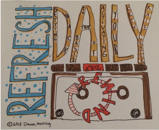 This Refresh Daily Rewind video focuses on dealing with False Starts and what we can learn about our creative process with the decision on where to go from a place of uncertainty and finding the value in every courageous step we take in our creative lives.
|
Dawn HerringDawn engages in many roles: As Writer/Blogger and Artist/Creative and Founder of Refresh with Dawn Herring: Where Art and JOY Align, She enjoys sharing from her vast experience as award-winning, life-long artist and leader in the field of written journaling, offering encouragement and proven tips to other journal keepers. Dawn's focus is on written journal keeping, artistic expression and finding your Creative Voice, and positive change that leads personal empowerment, encouraging you to leave your authentic and positive mark in the world. Dawn is a Commercial artist, hand letterer/illustrator and writer/blogger and enjoys sharing insights, humor, and encouragement as she shares from her life experiences as a woman, wife, mother of two grown daughters and as a Grandparent to a special needs grandson. She enjoys keeping a journal and reading spiritual texts to help keep the light on. May JOY Align with Your Creative Heart. Archives
August 2019
Categories
All
|
 RSS Feed