|
The purpose of this video, Creative Curiosity, is to encourage the pursuit of curiosity paths to enhance your creative practice. I include journaling and art journaling prompts. I'm coming from my Dawn Herring Collection Art Studio where I sit to paint with watercolor to share with you my thoughts on curiosity and where it can lead to help us build a Creative Practice worth keeping.
0 Comments
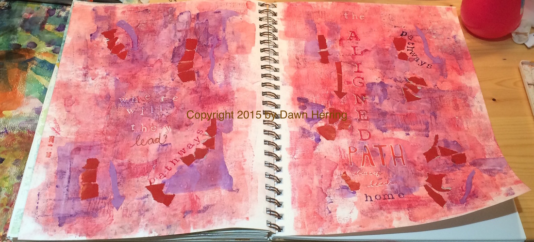
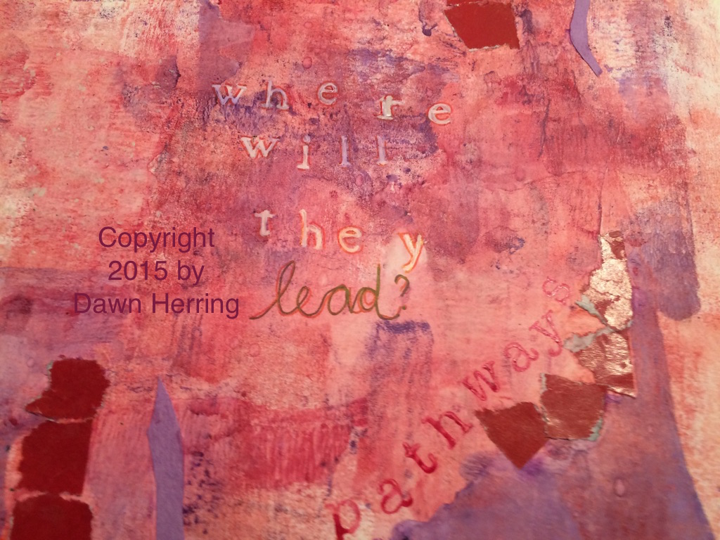
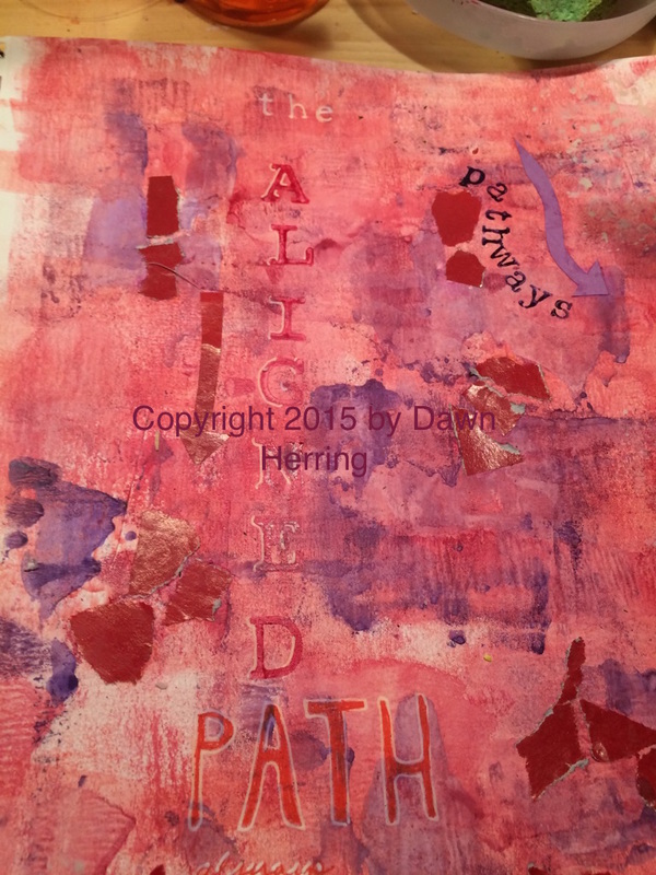
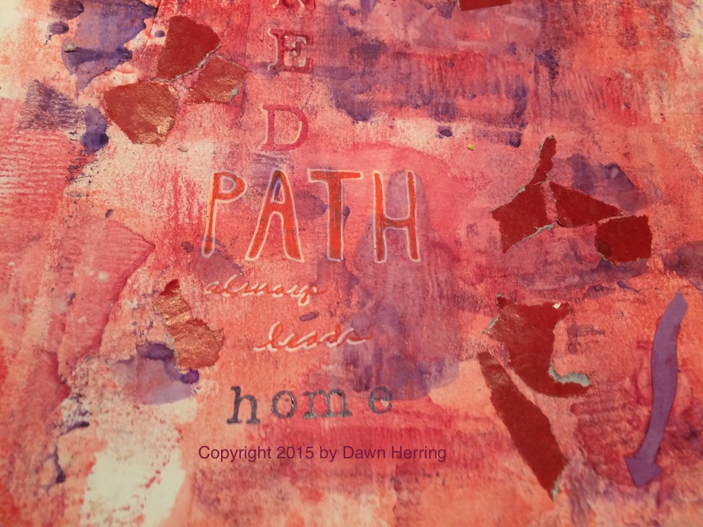
This art journal spread, Pathways, took me on a colorful pathway with reds and purples. Since my previous spread worked out so well with using a brayer to apply watercolor paint to the page, I decided to continue this trend yet again, applying layers of red washes. When I applied the purple hues, I used a palette knife for more focused areas and controlled application. Once I had that done, I accentuated the areas of paint with torn bits of magazine paper in red I had stashed and applied them with matte medium. This created areas or sections on each side, and they reminded me of pathways that lead to different places. Thus, Pathways, became my focus. That's when I determined to stamp out the word pathways along two of those sections, one on each side, using red and purple paint. As I considered the issue of Pathways and what ones are in my life right now, (this is what happens as I'm creating an art journal spread: it opens pathways of thought and brings subconscious ideas to the fore and that's when I learn something about myself; always worth the time invested). As I considered my next step in this spread, I began to think about what this message could be teaching me right now. In this process, I determined to stamp out the question: Where will they lead? I used my Uniball white pen on stamped letters and the wrote the word, Lead, with Uniball pens in different colors. I also outlined the white letters with red pen. Once I had the question down, I knew I needed a conclusive message to sort of answer it...What I determined was...The Aligned Path Always Leads Home. Aha! (Pause for a Epiphany moment). It's funny. My word for 2015 has been Aligned. (Yes, I'm sharing a secret here.) So naturally the word came to mind in conjunction with pathways. And that was my concluding answer...and you know how I determined that? Due to life experience. When I'm aligned, I'm HOME. Everything just FEELS right. And I know when I'm not. And want to get realigned as soon as possible!! So I stamped out the "the" in white Uniball pen, then stamped Aligned with large alpha stamps in red watercolor and highlighted them with white pen. I then hand drew letters for PATH with white pen and filled them with red pen. I hand wrote "always leads" and highlighted with white pen. Then I stamped "home" with ink and alpha letters. I also had some fun cutting out Arrows from colored construction paper and adhered them in various spots around the Pathways showing different directions. But the concluding "Story" behind this spread is I always want to be Aligned becomes that's where I'm home. And it's very good. Journaling Prompt:
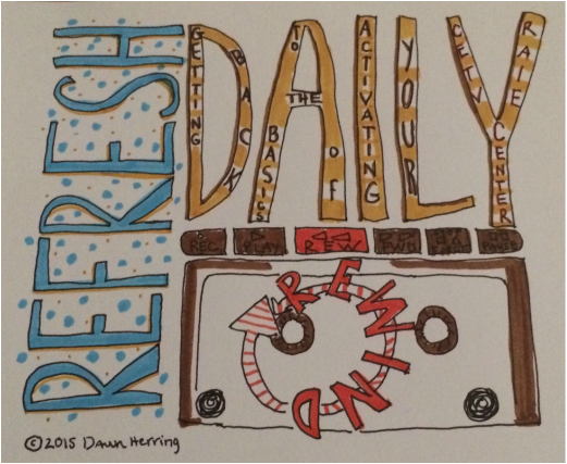
Do you know where your Aligned Path to HOME is? If so, detail what it feels like and looks like when you are there. Also describe when you know you're NOT aligned and the process you use to get realigned. Art Journal Prompt: Honor your HOME place in your art journal through images, text and maybe even colored arrows pointing to home using your favorite or associative colors that remind you of HOME. You can also use the word Aligned as a focal point. Copyright 2015 by Dawn Herring Copyright 2015 Art Journal Images by Dawn Herring Copyright 2015 Art by Dawn Herring Here is a new installation from my Refresh Daily Rewind video Series with the topic, Inner Expectations, where I share what mine are and how we can appreciate our current creative output and still challenge ourselves at the same time, all with the goal of Getting Back to the Basics of Activating Our Creative Centers!
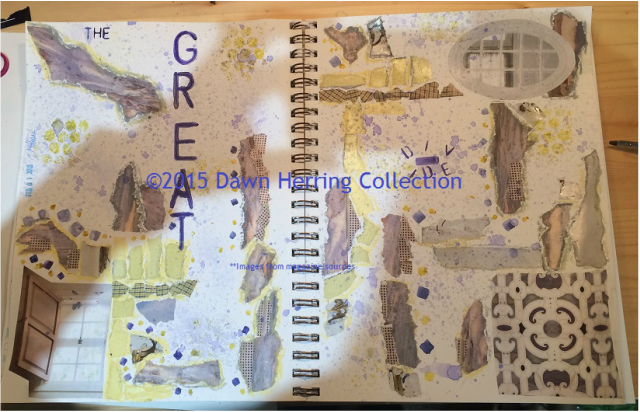
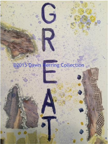
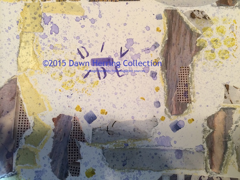
The Great Divide. I find it fascinating what comes to mind when I'm determining the Title of any art journal spread I create. I think titling a piece is a matter of resonation, association, or what something reminds you of. I often get titles as I'm working or even as I'm just starting, depending on what's on my mind. For this one, I titled it almost at the end. I started my process by priming the pages with gesso, then pulling collage fodder from my stash. I don't always use everything I pull out, but if it catches my eye, I put it aside just in case I want to use it. I might have had 6 or 7 different things and only use 3 or 4. The color, texture, or image will often have direct influence on whether I use it or not. Once I had all my elements laid out to my left, I started tearing what I liked the most and laying out different pieces in different spots. Sometimes I have to move stuff around or go vertical instead of horizontal. It really is about what suits my eye and what feels right to me. With this particular spread, I was working with an element of ocean and laying it next to what appeared to be a metal sheet with small holes in it, thus a rigid image. So water flowing versus a fixed metal sheet. As I tore these elements and lay them side by side, I was quite surprised by the visual and even visceral difference between the two. It was as if I was dealing with a visual dichotomy (as you can see in the second image on the right side as well as below.) That experience with the collage got me thinking about the difference between flow and resistance. We may notice life's natural ebb and flow. Where we experience things come together and then the resistance comes to meet us in our path. And we may feel stymied by that resistance. Thus creating a Great Divide between where we are and where we want to be.
We may feel a Great Chasm has been created by this resistance and feel frustrated as a result. But in reality, there is no chasm. Because everything is linked; there is no separation. Only oneness. Yes, we still feel the resistance and wonder where to go from here. But the best thing we can do is let go and have no expectation. It is often then that we can experience peace and then life begins to flow once again. I know when I want to resist something, it just becomes a greater challenge than it needs to be. It's all about being at peace with what is. I know, easier said than done, right? With this particular spread, I decided to try something NEW. Oh yes, experimentation! I recently purchased a small spray bottle while I was at Albertson's the other day. I wanted to use it with watercolor and see what effects I could create in my art journal. So I mixed some purple and blue from my Prang watercolor set and added some water. It took some doing to get it going but once it did, I managed to cover the whole spread with it. But then it stopped working. I was experiencing the very resistance I was debating about. I will, of course, try using it again, perhaps with more water and see if that helps it flow better. (I also recalled my liquid inks that I haven't used in a while since I originally purchased them to use with my pen (pen and ink) but they didn't flow well enough for my nib, thus they lay dormant; so I think I may try them with the spray bottle for my art journal.) As you can see in the images above, my watercolor spray did work! It created enough color, texture and visual interest to satisfy me. And even unify what can feel like miles apart when in fact they are closer than we realize. Art Journal/Journaling prompt: Are you experiencing a chasm or Great Divide in your life? Are you in a place that feels miles apart from where you want to be? Describe where you are and where you want to be in your journal. Then compare the two places and see what similarities there are between them. You may want to try doing a mind map with this one too and see if any similar words show up. For your art journal, honor where you are visually and where you want to be. Use color to express your heart. Then determine where things actually line up, both visually and in your life and see what next step you can take and also how you can feel at peace with what is. I also added some oil pastel around the collage elements, some bubble wrap texture and some watercolor square detail in various sizes using a new stencil I recently purchased at Michael's. The details also matter; in fact, sometimes the details make a situation, especially when we have grown discontent. I find myself loving detail more all the time as an artist. It just enhances the big picture, making life more beautiful overall. And then we feel the unity more than what feels like distance in our hearts. Copyright 2015 Dawn Herring |
Details
Dawn HerringDawn engages in many roles: As Writer/Blogger and Artist/Creative and Founder of Refresh with Dawn Herring: Where Art and JOY Align, She enjoys sharing from her vast experience as award-winning, life-long artist and leader in the field of written journaling, offering encouragement and proven tips to other journal keepers. Dawn's focus is on written journal keeping, artistic expression and finding your Creative Voice, and positive change that leads personal empowerment, encouraging you to leave your authentic and positive mark in the world. Dawn is a Commercial artist, hand letterer/illustrator and writer/blogger and enjoys sharing insights, humor, and encouragement as she shares from her life experiences as a woman, wife, mother of two grown daughters and as a Grandparent to a special needs grandson. She enjoys keeping a journal and reading spiritual texts to help keep the light on. May JOY Align with Your Creative Heart. Archives
August 2019
Categories
All
|

 RSS Feed